
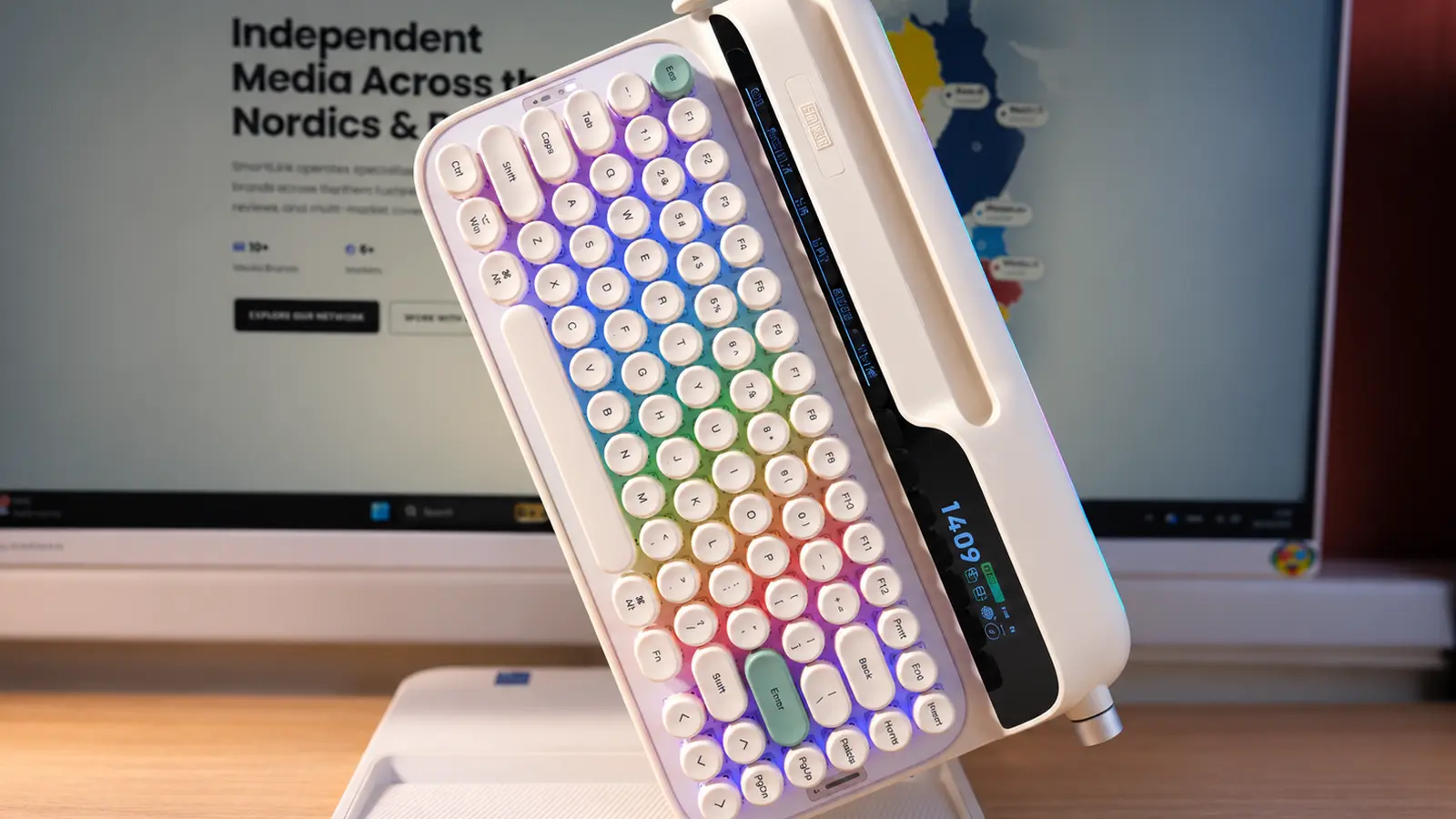
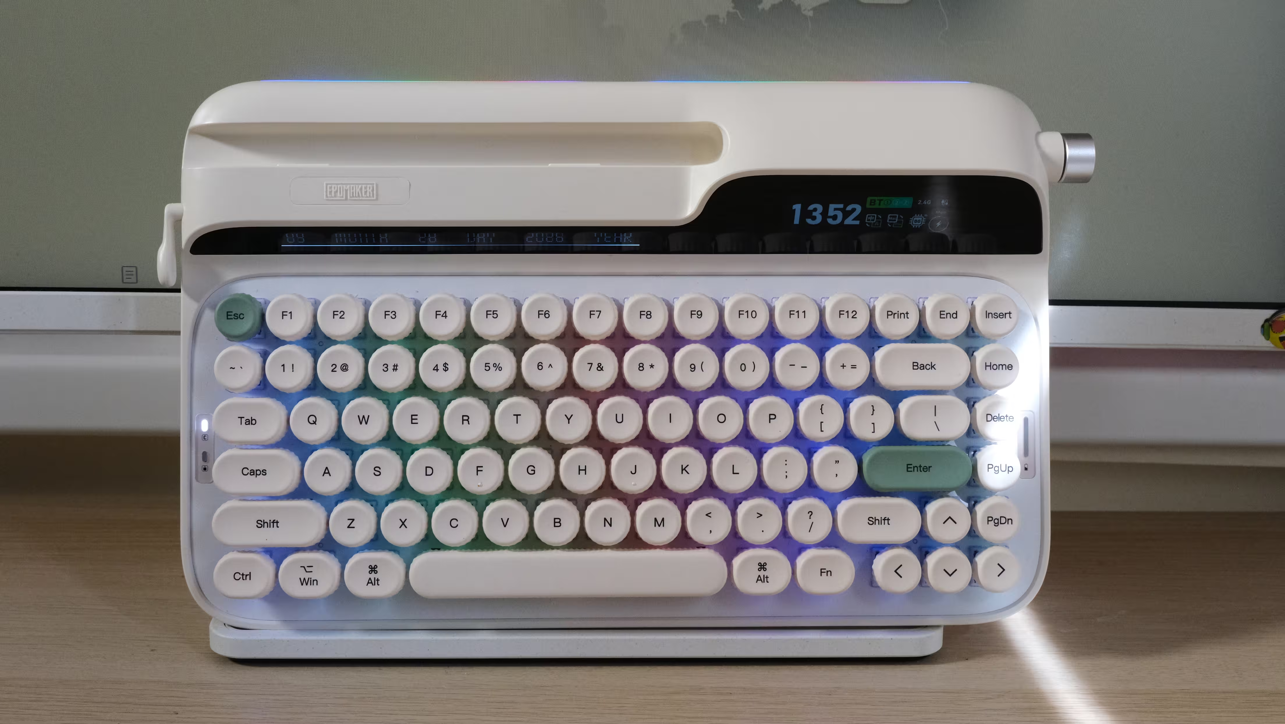
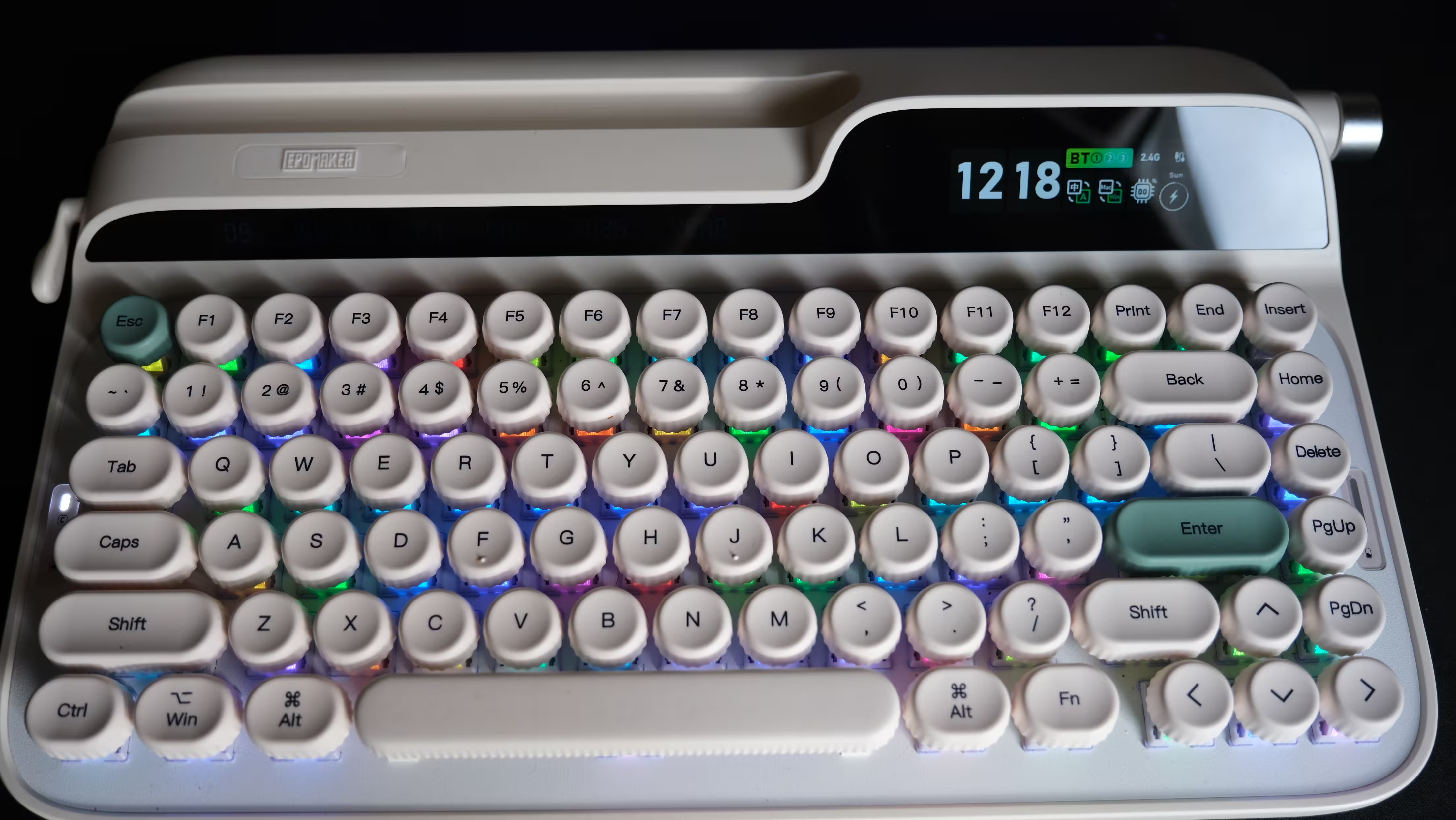
Some keyboards are happy to disappear into the background. They sit on your desk, register your keystrokes and get on with the job. The EPOMAKER Glyph has rather different ambitions. With its round keycaps, cream-colored body, side lever and dual displays, this is a keyboard that wants to be noticed. Imagine an old typewriter discovering Bluetooth and RGB lighting, then deciding it was ready to return to work.
At $139, however, an interesting appearance is only the beginning. Once the novelty wears off, would I still want to write thousands of words on it every day? The typing sound and generous features make a convincing introduction, but the height of the keys and some software limitations deserve just as much attention as the retro styling.
EPOMAKER supplied the Glyph for this review. The opinions below reflect my own experience with the keyboard.
Design and Build Quality: Plenty of Personality, Plenty of Plastic
The Glyph’s biggest design achievement is that its retro identity goes beyond a few differently colored keycaps. The shape of the case, the round keys with their ridged edges, the lever on the left and the display section all contribute to the typewriter appearance. Two green accent keys bring some life to the cream finish without making the desk look like a toy shop window.
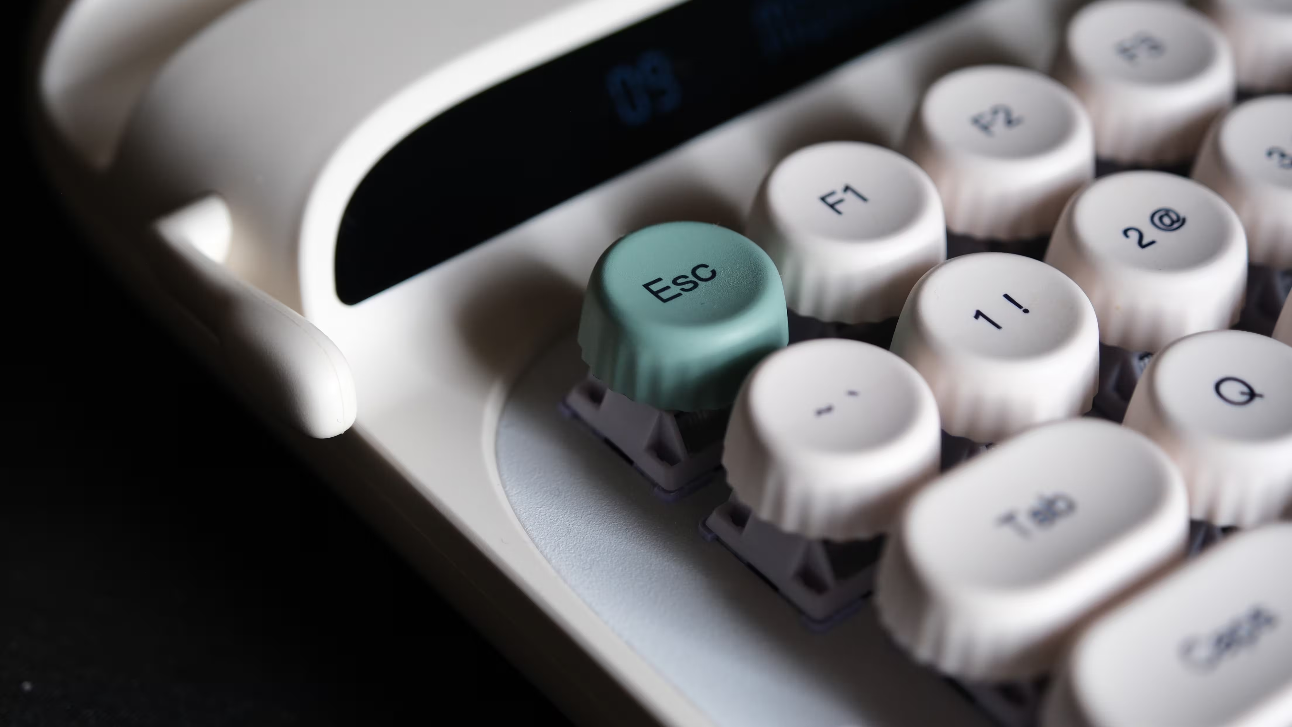
The outer case is plastic. The presence of aluminum components inside the keyboard should not be confused with an all-metal enclosure. That is not automatically a drawback, but anyone expecting the cool, substantial feel of an aluminum case at this price should adjust their expectations. The plastic itself feels good, and I enjoyed using the keyboard.
At approximately 1.18kg, the Glyph is hardly a lightweight travel companion. It weighs more than some laptops. That weight helps it stay planted on a desk, but there are more convenient options if your keyboard regularly commutes between home and the office.
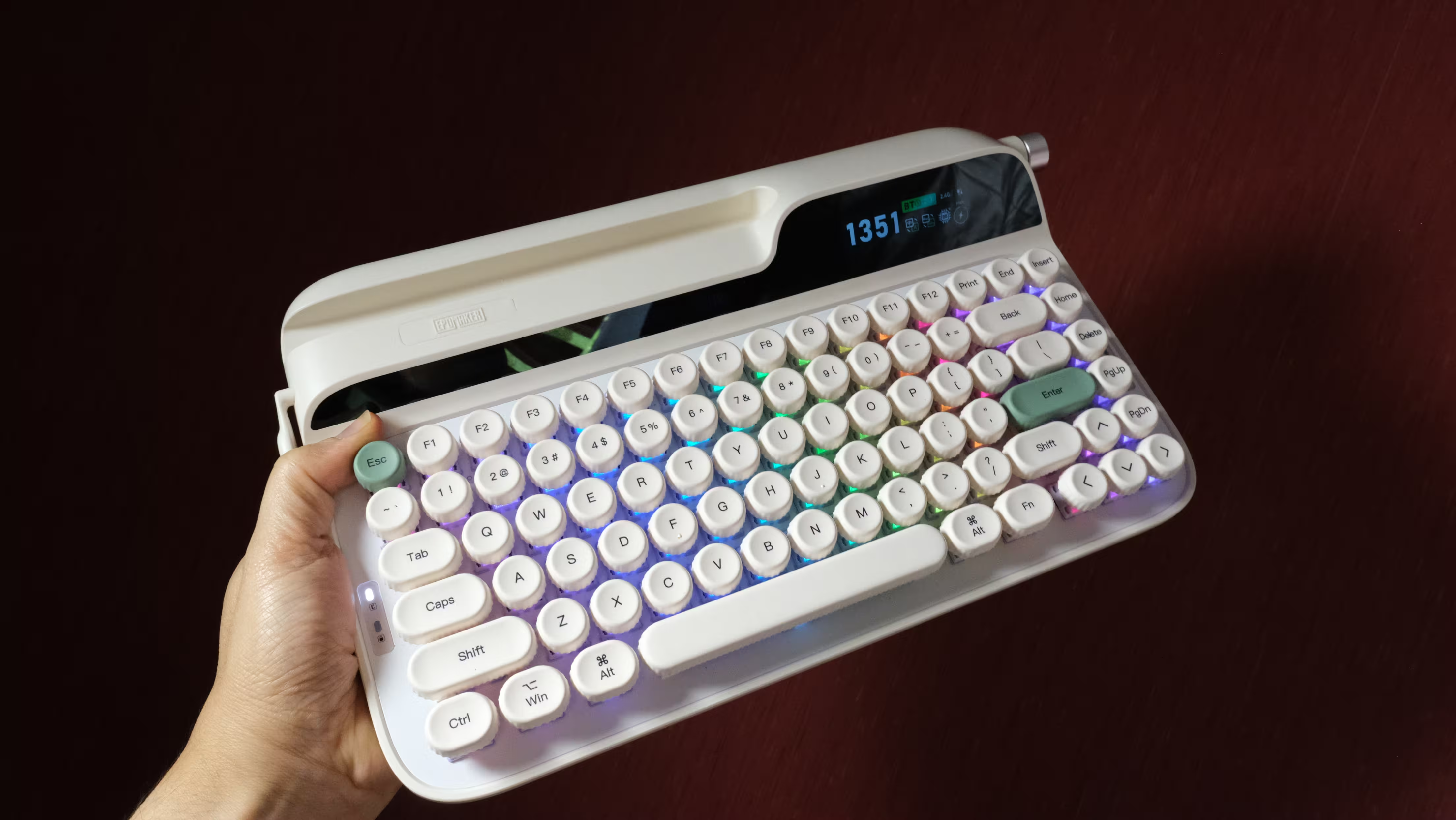
The 75% layout includes 83 keys, retaining the function row and dedicated arrow keys while leaving out the number pad. However, a compact key layout does not necessarily mean a compact overall footprint. The upper housing, displays and phone or tablet slot add considerable depth.
If desk space is limited, check the dimensions before buying. This is not a minimalist keyboard that quietly squeezes into whatever space remains beside your mouse.
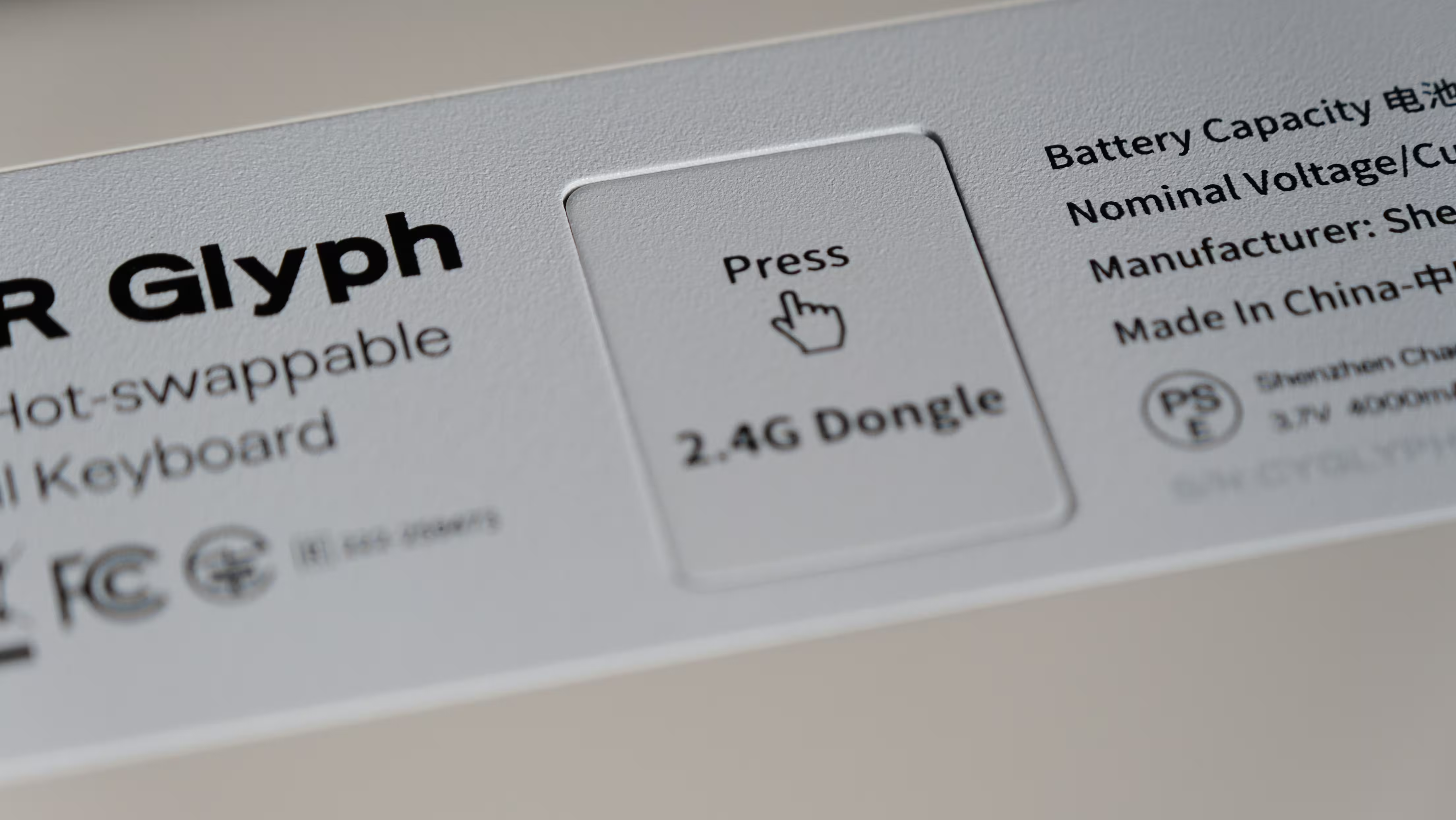
One particularly thoughtful detail is the magnetic compartment for the wireless receiver. A dedicated storage spot is useful when switching between wired and wireless connections. Tiny USB receivers have a remarkable talent for disappearing, usually immediately before you need them.
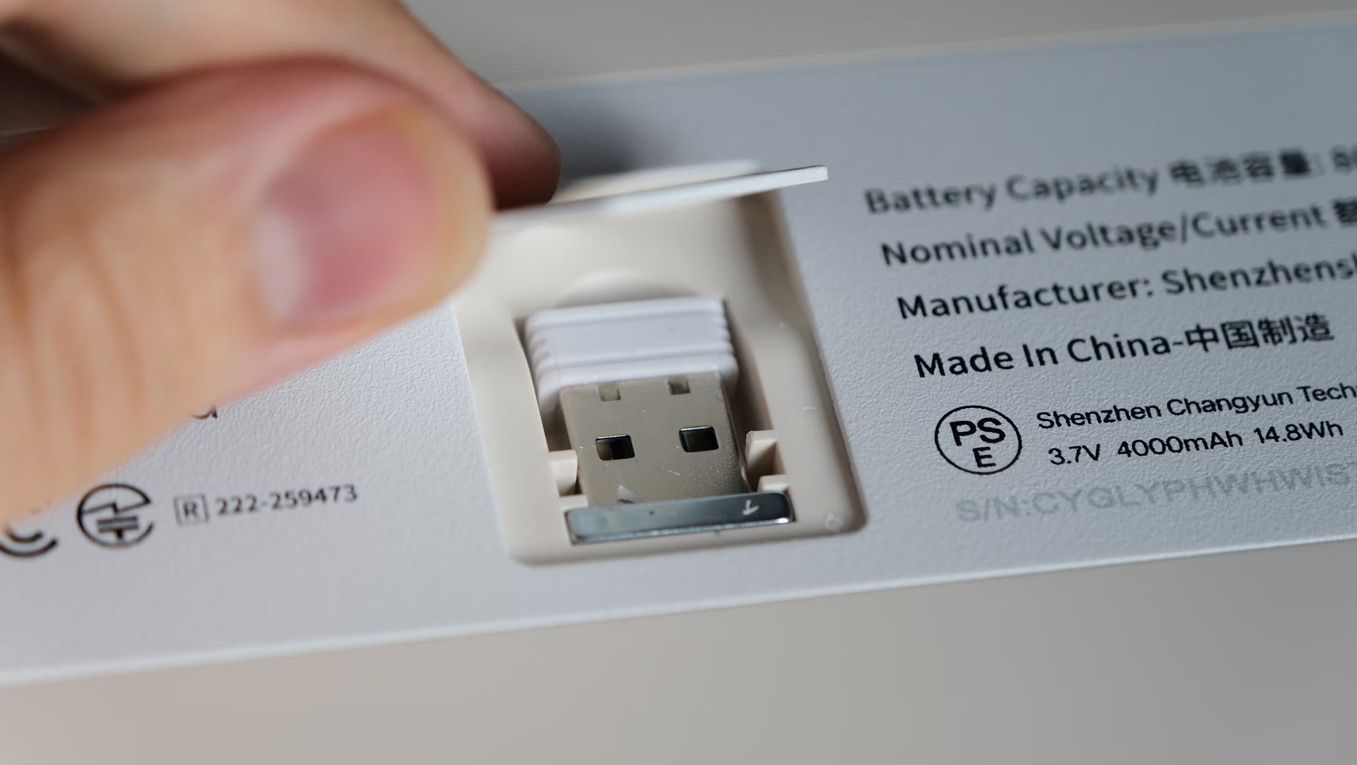 | 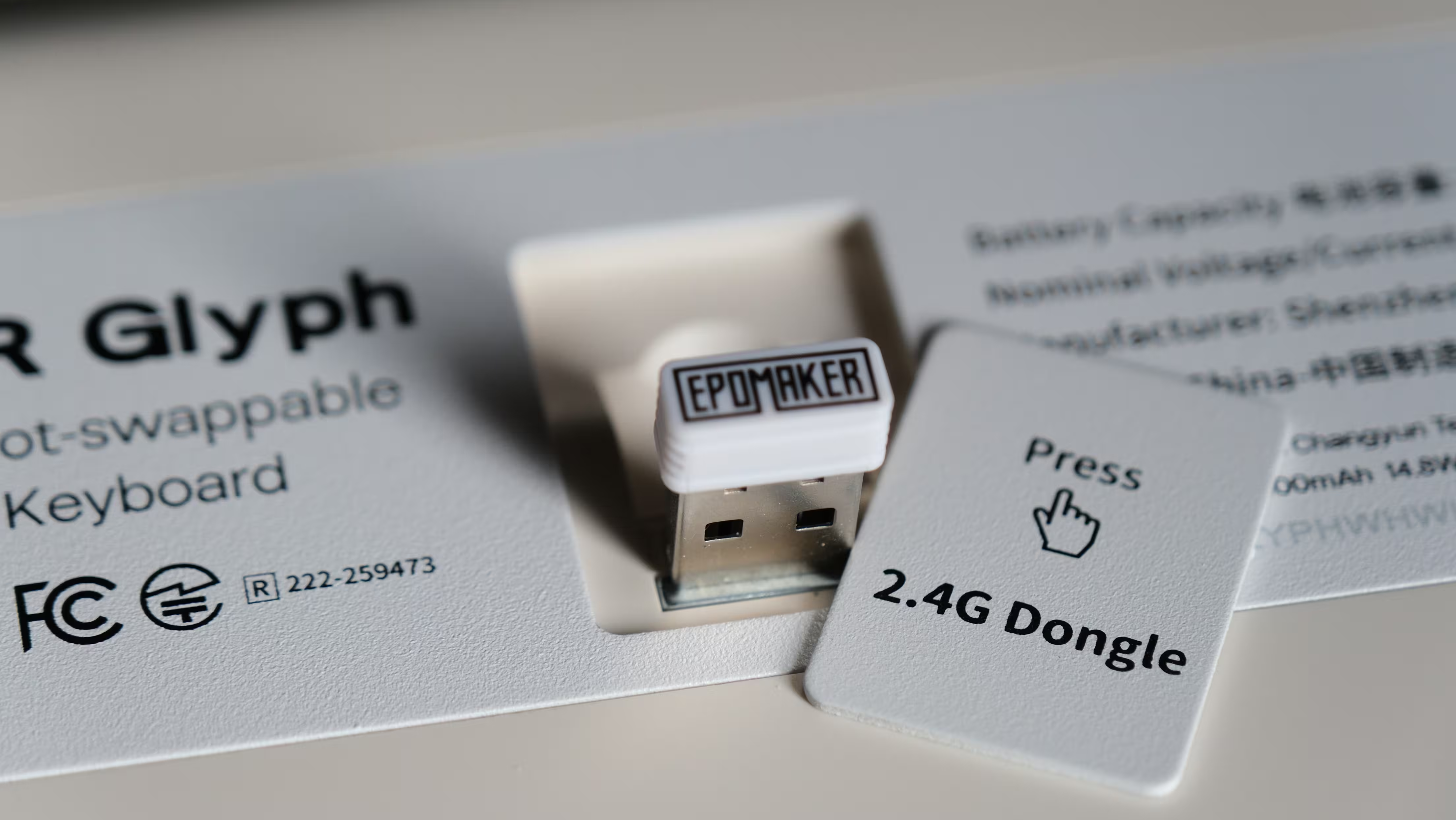 |
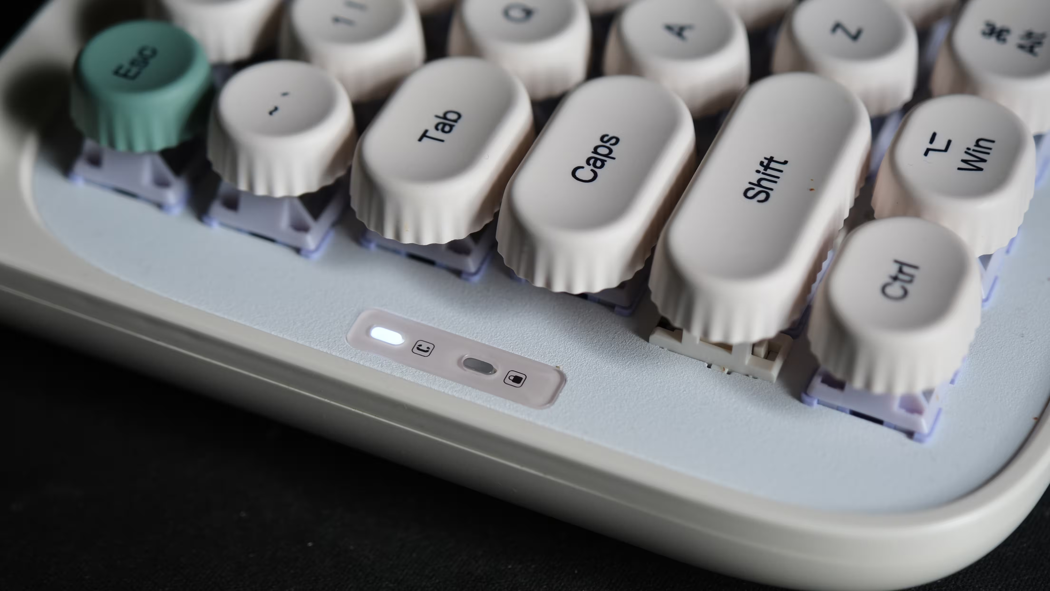
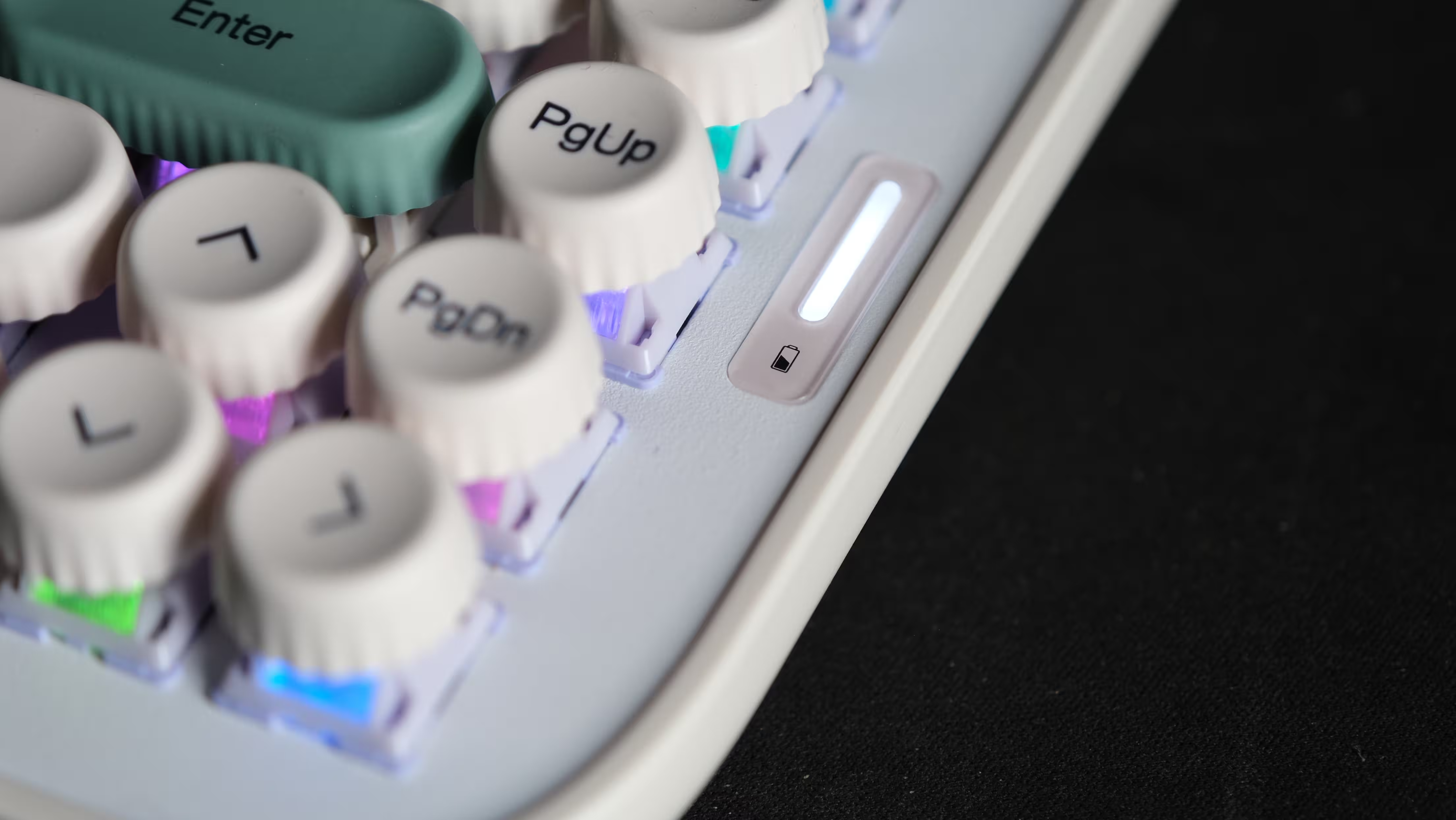
A slim, vertical white indicator on the right shows battery status, while small indicators on the left cover Caps Lock and the lock function. These are modest additions, but they make the keyboard’s status easier to check at a glance.
 |  |
In the Box: The Wrist Rest Matters More Than You Might Think
Alongside the keyboard, EPOMAKER includes a USB cable, a keycap and switch puller, spare switches, foot pieces and a silicone wrist rest.
Tools and replacement switches are welcome inclusions for a hot-swappable keyboard, but the wrist rest is arguably the most important accessory here.
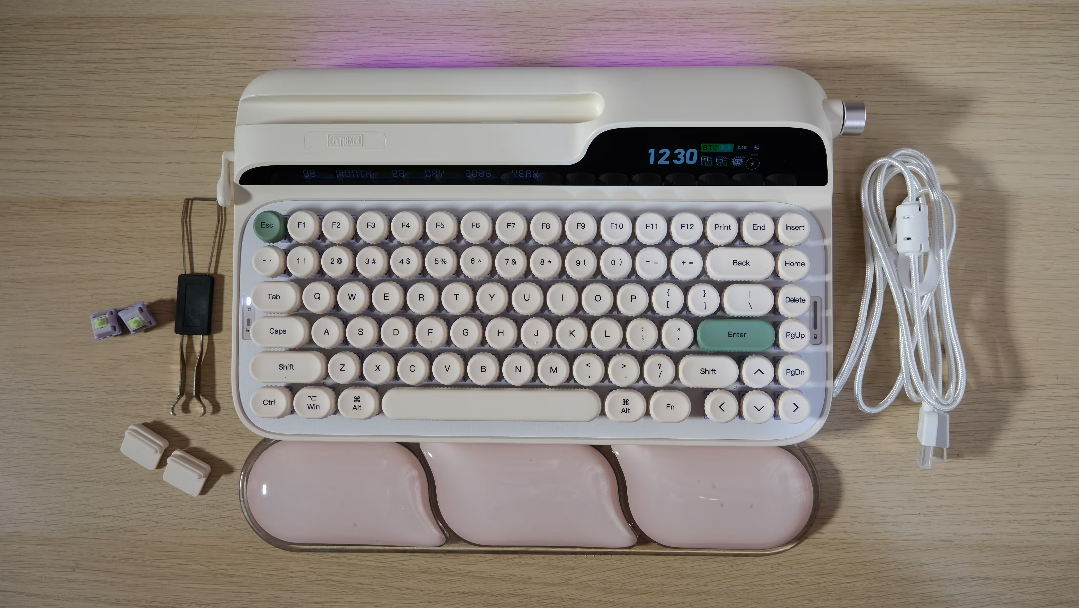
It is not simply something included to make the unboxing photograph look more generous. The height of the keys means it can make a meaningful difference to comfort. Its soft surface and coordinated appearance are both welcome, although including a wrist rest does not automatically solve every ergonomic issue.
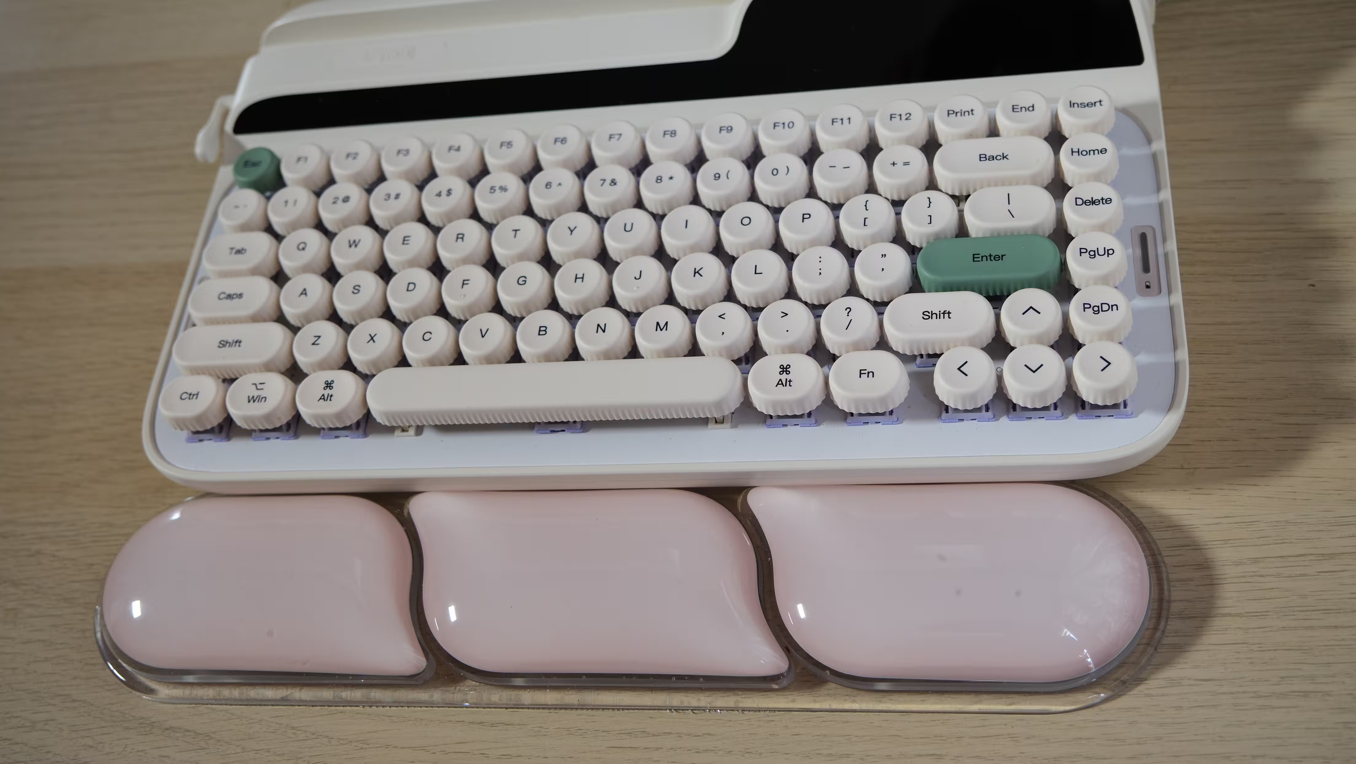
Anyone moving from a slim office keyboard or a laptop will immediately notice the change in typing height. The Glyph asks your hands to settle into a different position, and that adjustment deserves more consideration than the color of the lighting.
Typing Experience: A Sound Worth Sitting Down For
My version of the Glyph uses EPOMAKER Wisteria V2 linear switches. There is no deliberate tactile bump or click during the keypress; instead, the movement is light and smooth.
That makes quick typing enjoyable, although the light action may also produce accidental inputs if you tend to rest your fingers heavily on the keys.
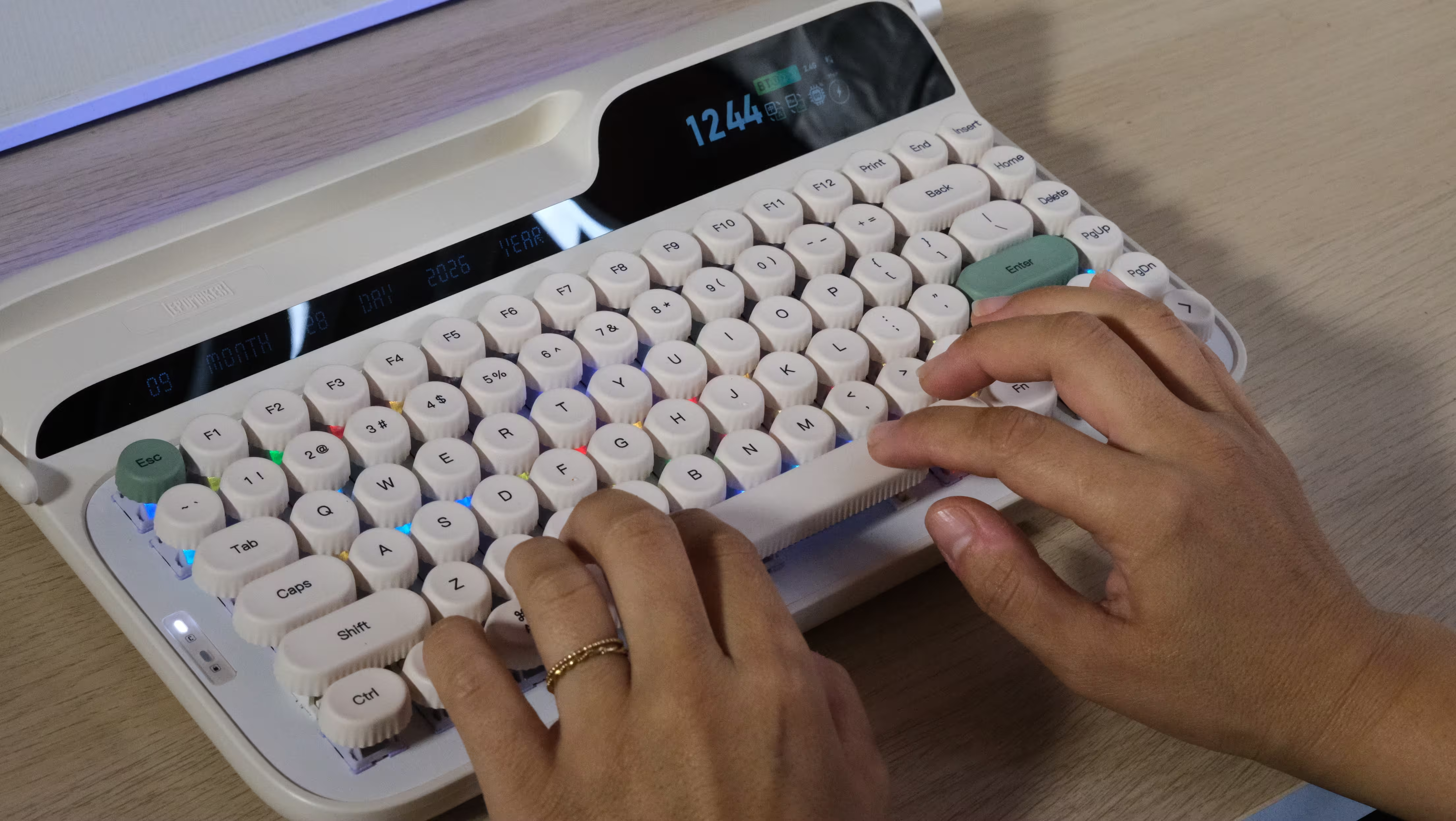
The round keycaps introduce another adjustment. Their contact area and the gaps between their edges feel different from conventional square keycaps. If you have spent years typing on a more traditional keyboard, expect a few early mistakes while your fingers learn their way around.
The slightly concave surfaces help guide your fingertips toward the center, but an unusual shape does not become universally comfortable simply because it looks good.
The top-mount construction gives keystrokes a firm, direct feel. There is little of the soft, springy movement associated with some gasket-mounted keyboards. Whether that is preferable comes down to taste. Some people enjoy a solid landing, while others want more cushioning.
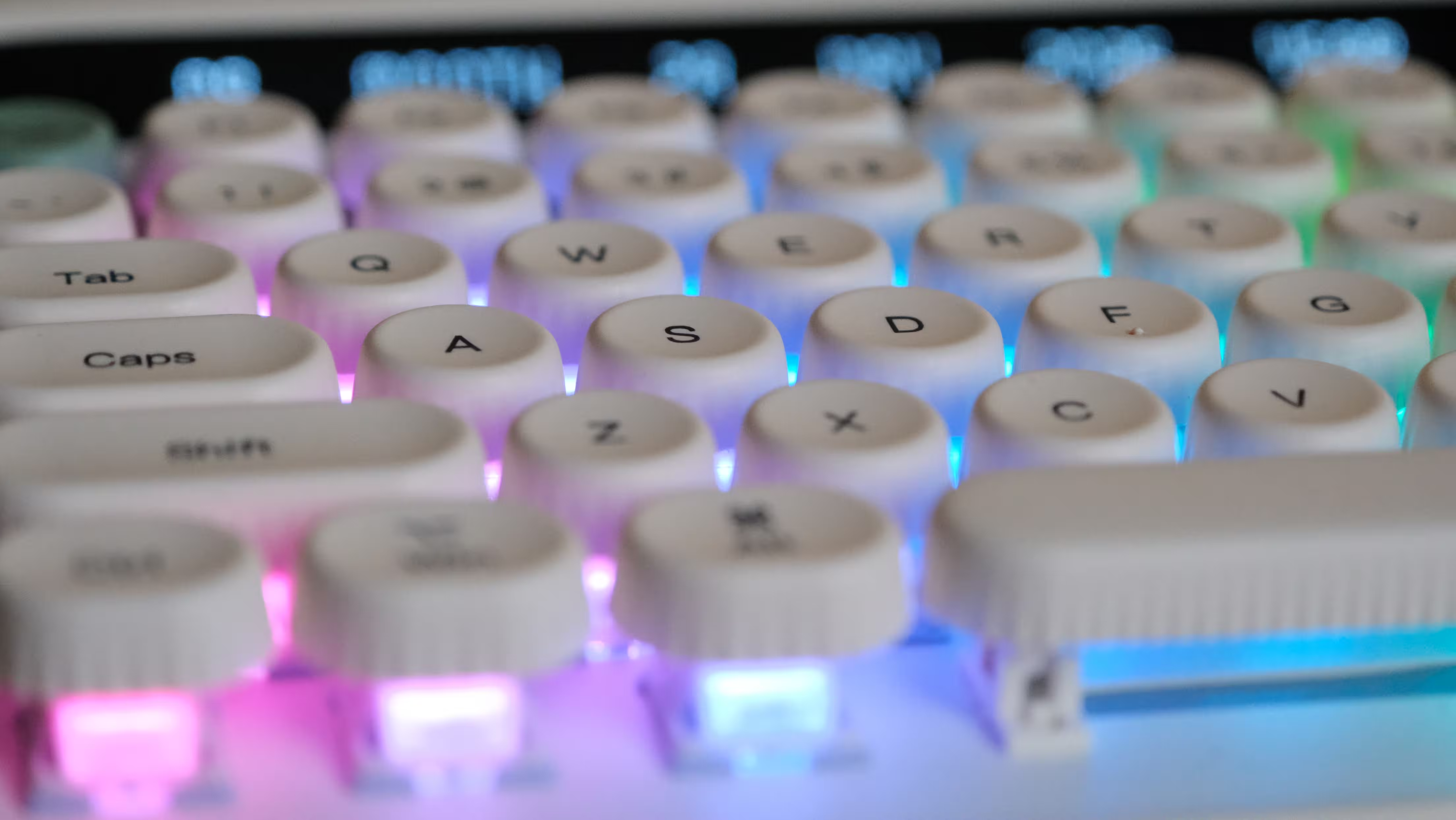
Personally, I loved typing on the Glyph.
My review unit has English-language legends. You can select your preferred typing language in the operating system, but that will not change the printed characters or the physical layout. For anyone accustomed to a Nordic, Baltic or another regional layout, this is worth checking before buying. Experienced touch typists may adjust more easily; adding labels to those round keycaps is a less elegant solution.
As for the sound, “creamy” is a description frequently applied to keyboards like this. If you are unfamiliar with mechanical keyboard terminology, it probably sounds more appropriate for a bakery.
Here, it describes a relatively full, rounded sound without much metallic ringing. Gentle typing keeps it more restrained, while pressing the keys firmly to the bottom of their travel produces a clearer, sharper note.
The sound is one of the Glyph’s strongest attractions. The stabilizers on the larger keys also made a generally positive impression, helping those keys feel and sound consistent. There is a satisfying rhythm to writing on it that made me want to keep going.
Just do not mistake satisfying for silent.
Linear switches lack the deliberate click of clicky switches, but the keys still make plenty of audible sound. In a shared room or a quiet office, your enthusiasm may not be universally shared. What sounds like a private typing concert to you could be somebody else’s reason to buy noise-canceling headphones.
Ergonomics: The Biggest Compromise
If there is one thing to investigate before buying the Glyph, it is typing comfort.
The combination of tall keys, relatively uniform keycap profiles and limited tilt will not suit every pair of hands. The rows do not have the pronounced differences in shape and angle found on many sculpted keycap sets.
 |  |
That contributes to the typewriter appearance, but it can also make reaching between rows feel less natural for some users.
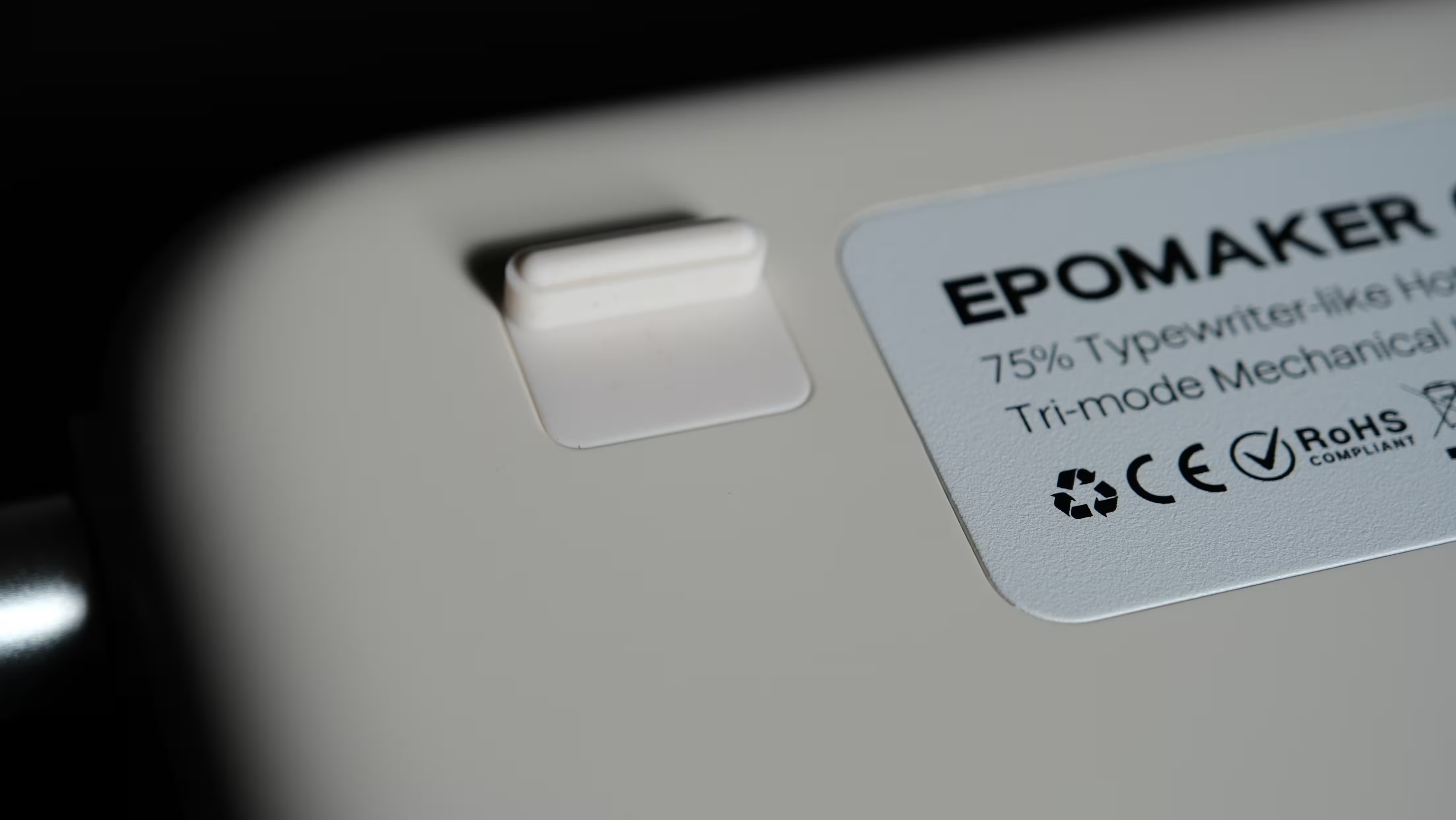
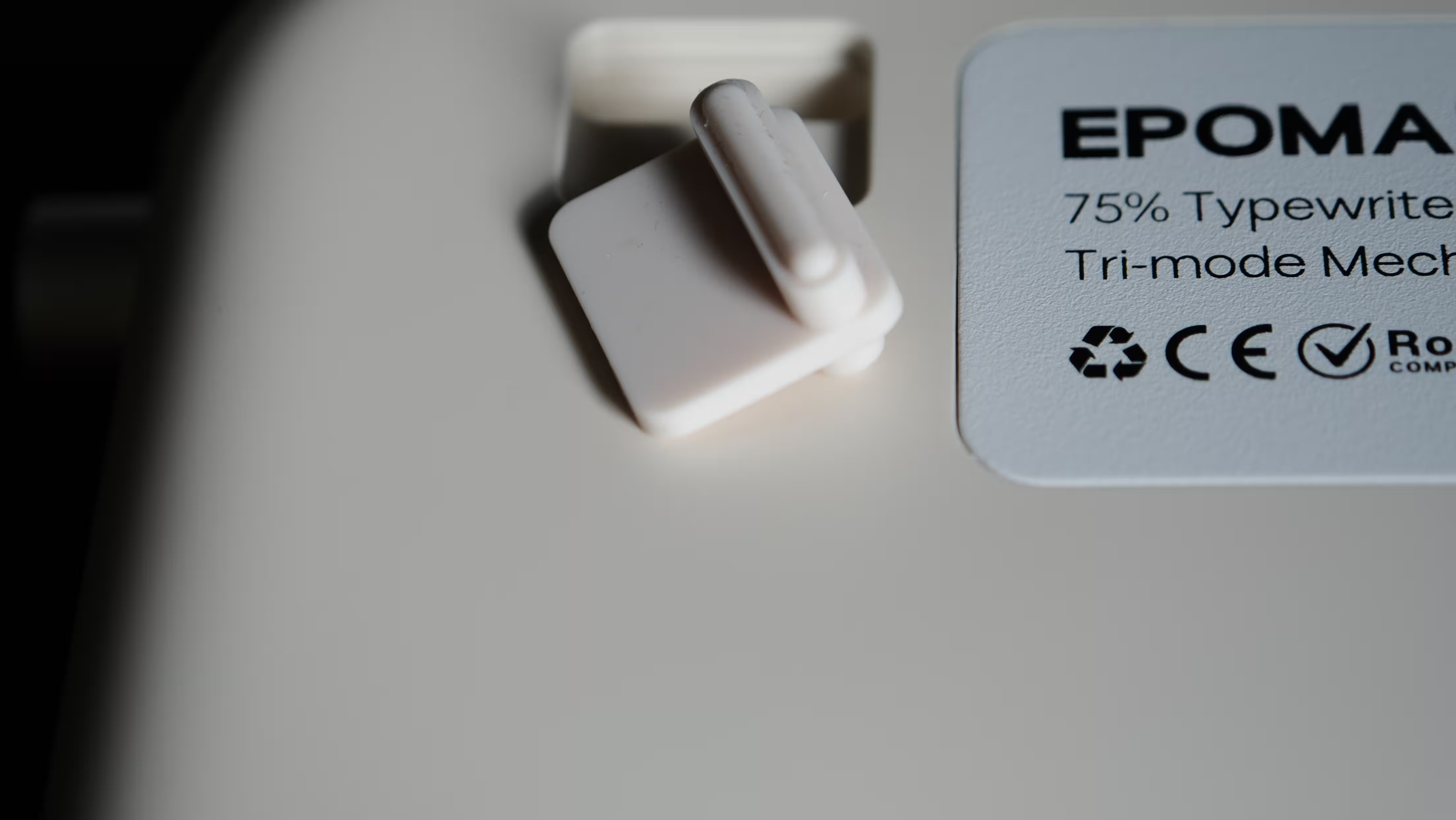
There is very little meaningful angle adjustment. Two small rubber foot pieces can be reversed to raise the keyboard slightly, but the difference is modest. This is not the kind of adjustment that substantially changes the typing position.
The included wrist rest is soft and squishy, and it may help. Still, if getting comfortable requires simultaneously adjusting your chair, desk, keycaps and the support underneath the keyboard, the basic shape might simply be wrong for you.
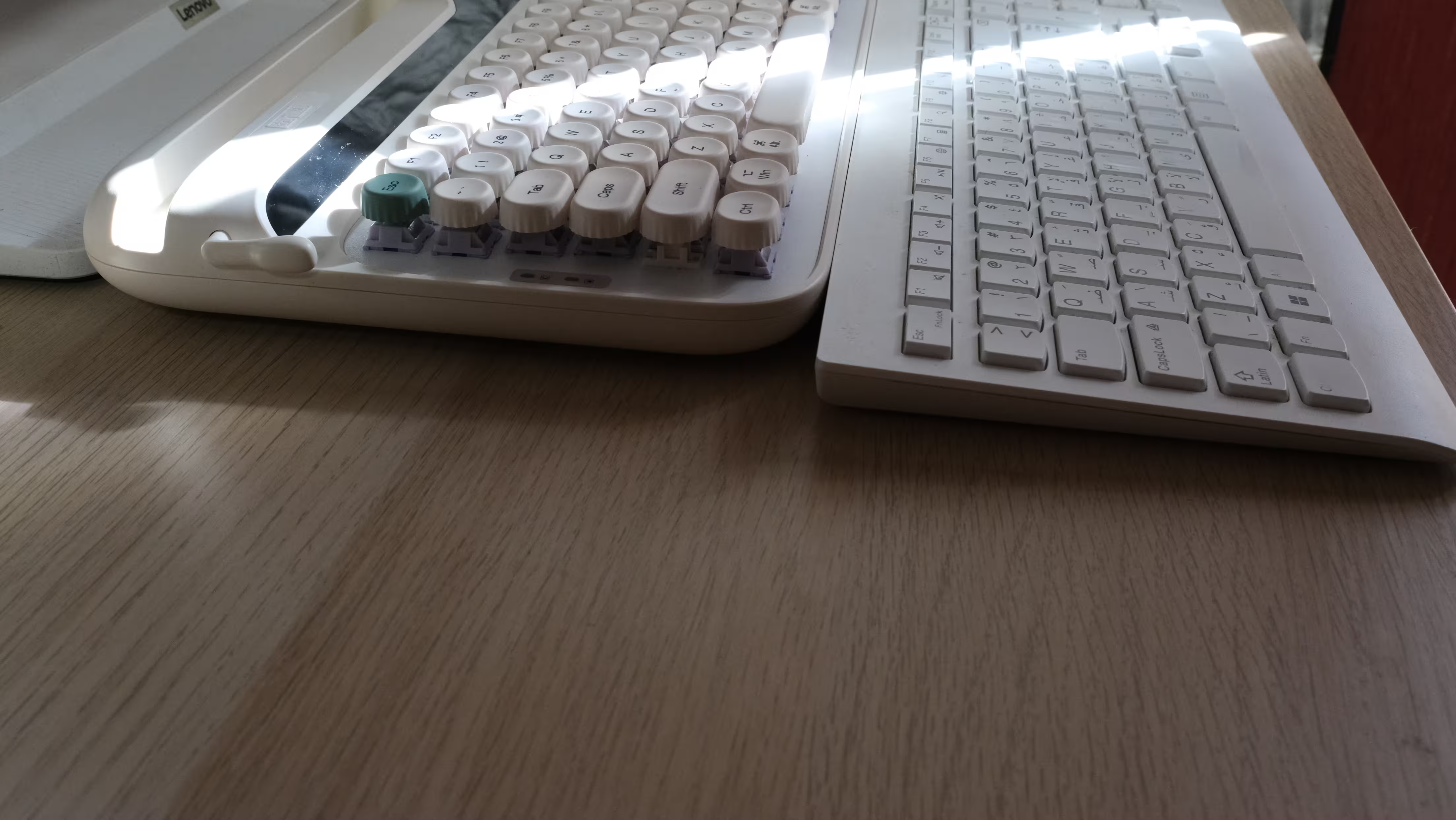
If possible, try the Glyph before committing to it.
This is especially relevant if you currently use a slim Lenovo keyboard or a laptop such as a MacBook. A few experimental keystrokes are not enough to judge the transition. The Glyph can win you over visually in seconds; whether your hands feel the same way becomes clearer after a long writing session.
The Lever and Volume Dial: One Useful, One Mostly Nostalgic
The volume dial is the kind of feature that quickly becomes part of your routine. Adjusting sound with a physical control feels convenient when listening to music, watching videos or joining a call.
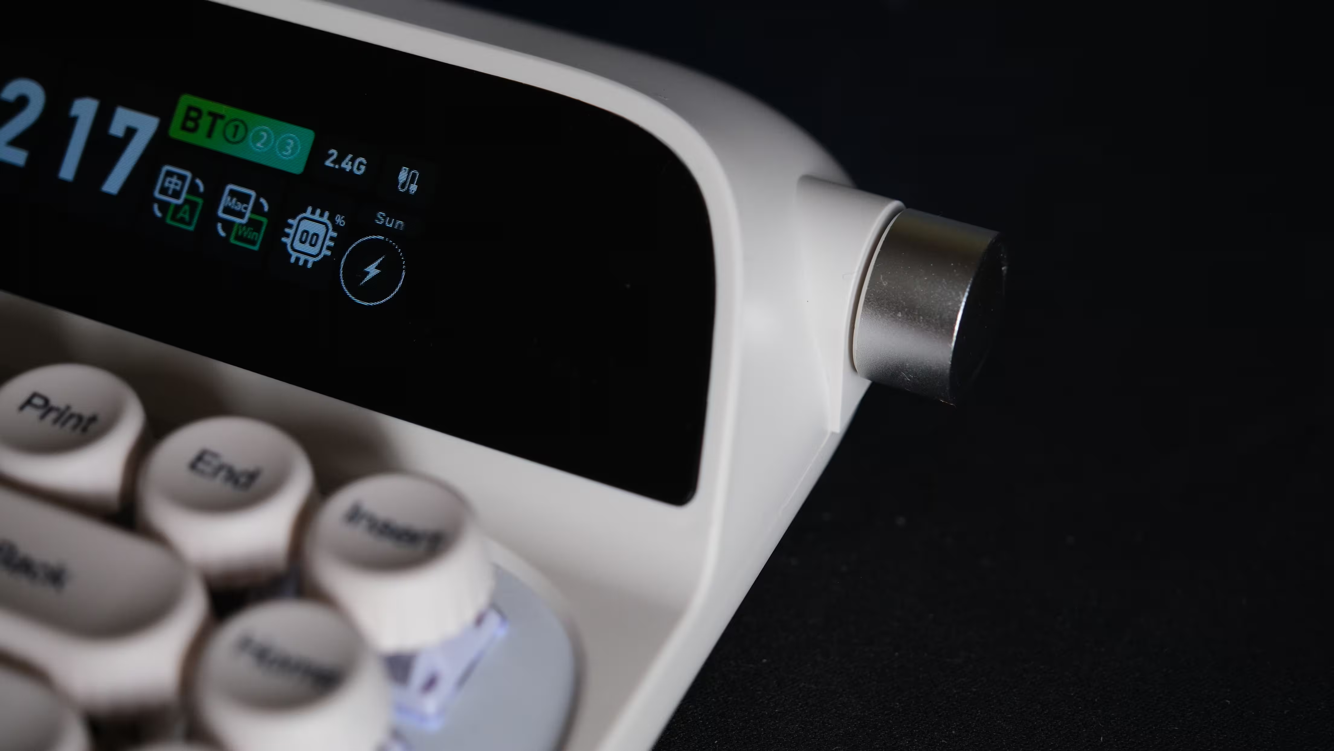
There is some scope to customize its behavior, too. The feel of the rotation and how comfortably you can operate it with one finger are matters of preference, but I liked having it.
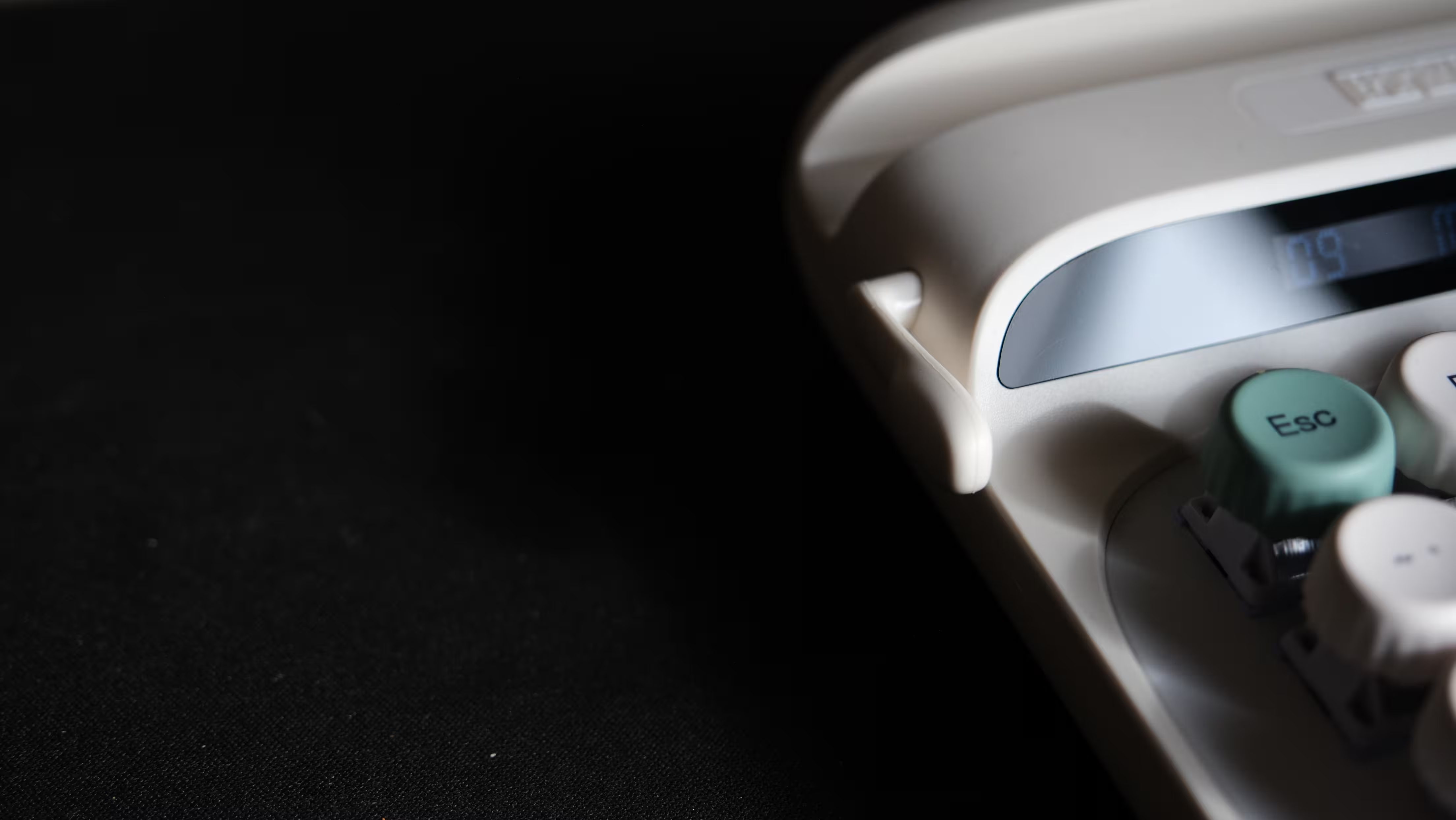
The lever on the left is more complicated.
Moving it upward triggers Enter, while moving it downward activates Backspace. In principle, that gives one of the Glyph’s most distinctive visual features a practical purpose.
In practice, it was also the part of the keyboard I felt least confident about.
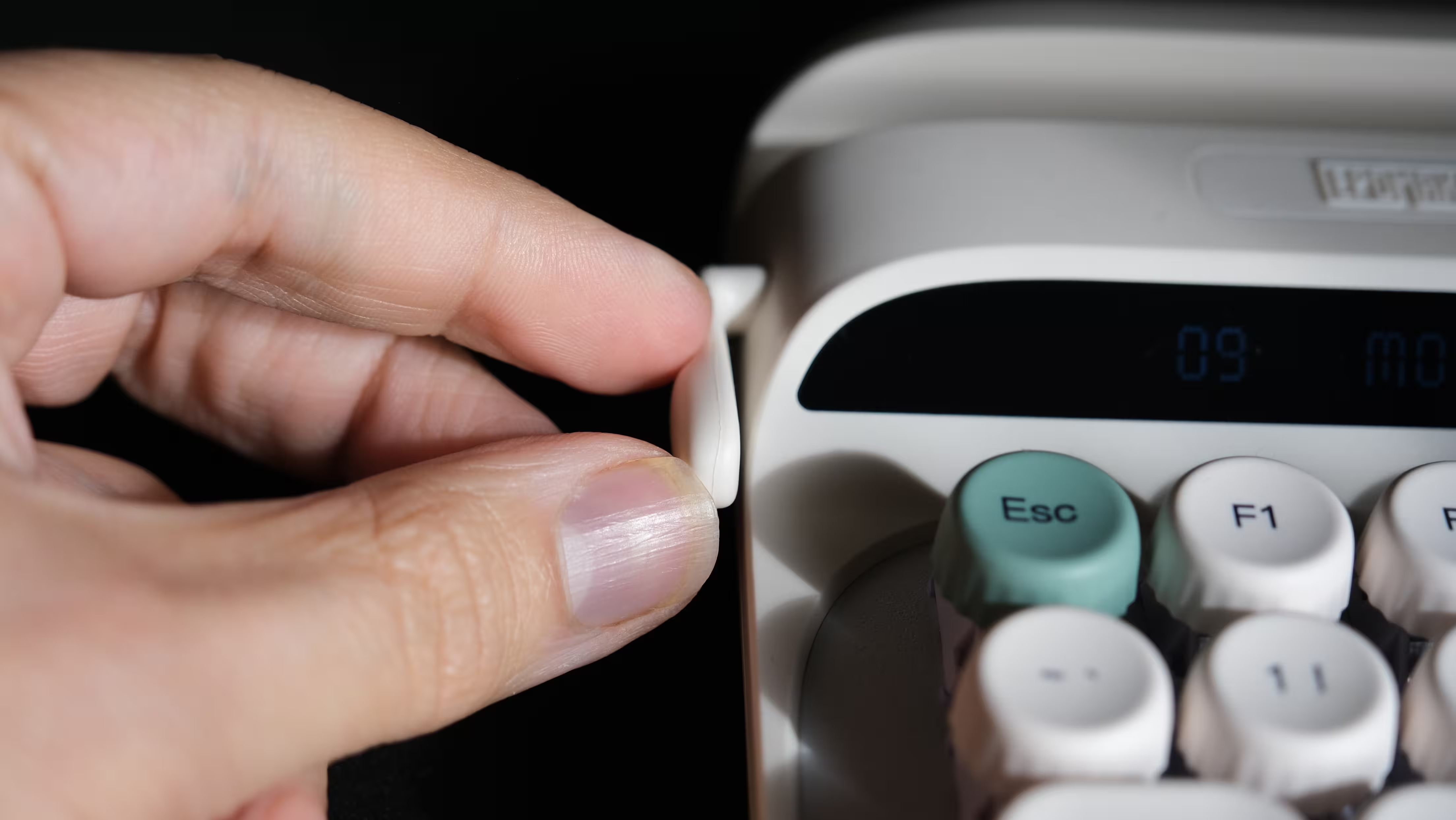 | 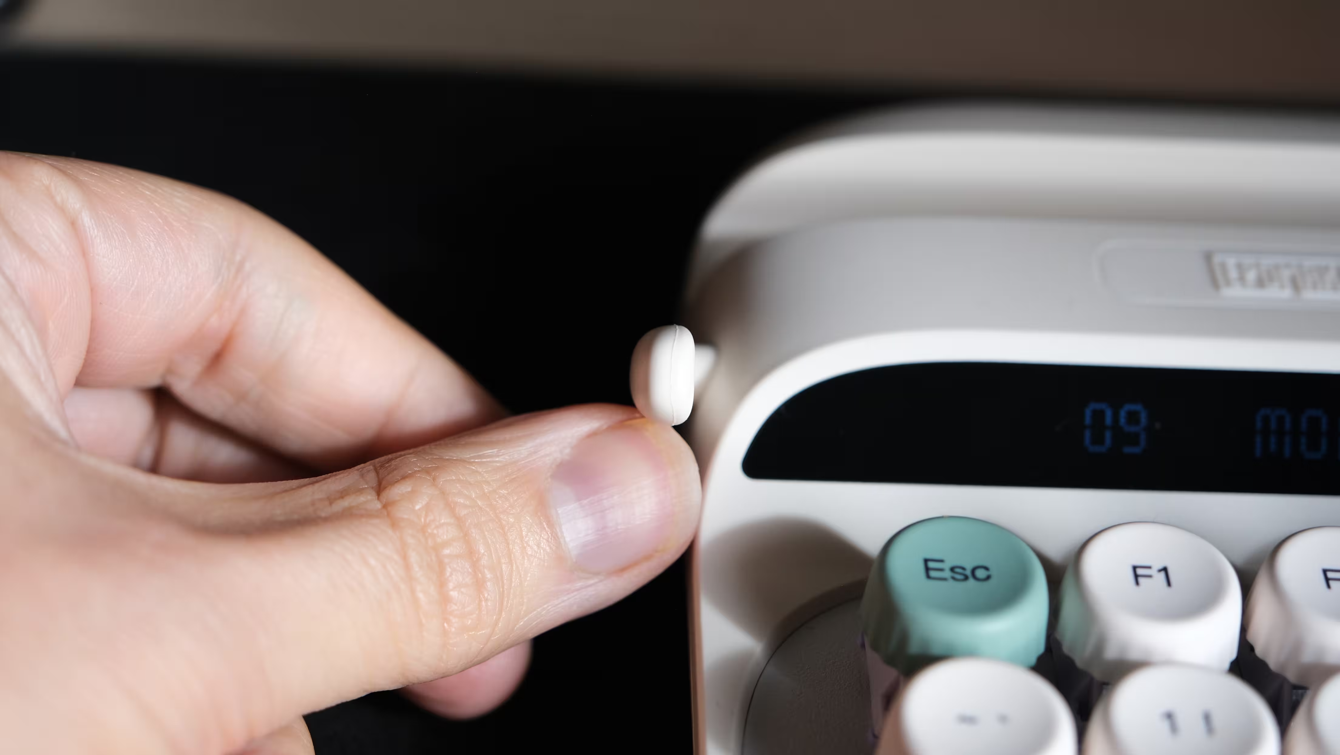 |
I was generally happy with the quality of the Glyph, but the thin lever made me worry about its durability. That is a concern about its construction, rather than a report that it broke during my review. I would have preferred something thicker and more substantial, with a feel closer to the volume dial.
Its limited customization also reduces its usefulness. A control this prominent would be more appealing if it could be adapted more freely to different workflows.
Ultimately, I see it primarily as a nostalgic detail. It connects the Glyph to the typewriters that inspired it, but it did not become an essential part of my daily typing.
Dual Displays and RGB: More Personality Than Practicality
The two displays are central to the Glyph’s identity. A narrow date display sits alongside a customizable color screen, creating an unusual combination above the keys.
Showing the time, connection status or a favorite image or GIF certainly gives the keyboard more personality. Whether these displays make it meaningfully more useful is another question.
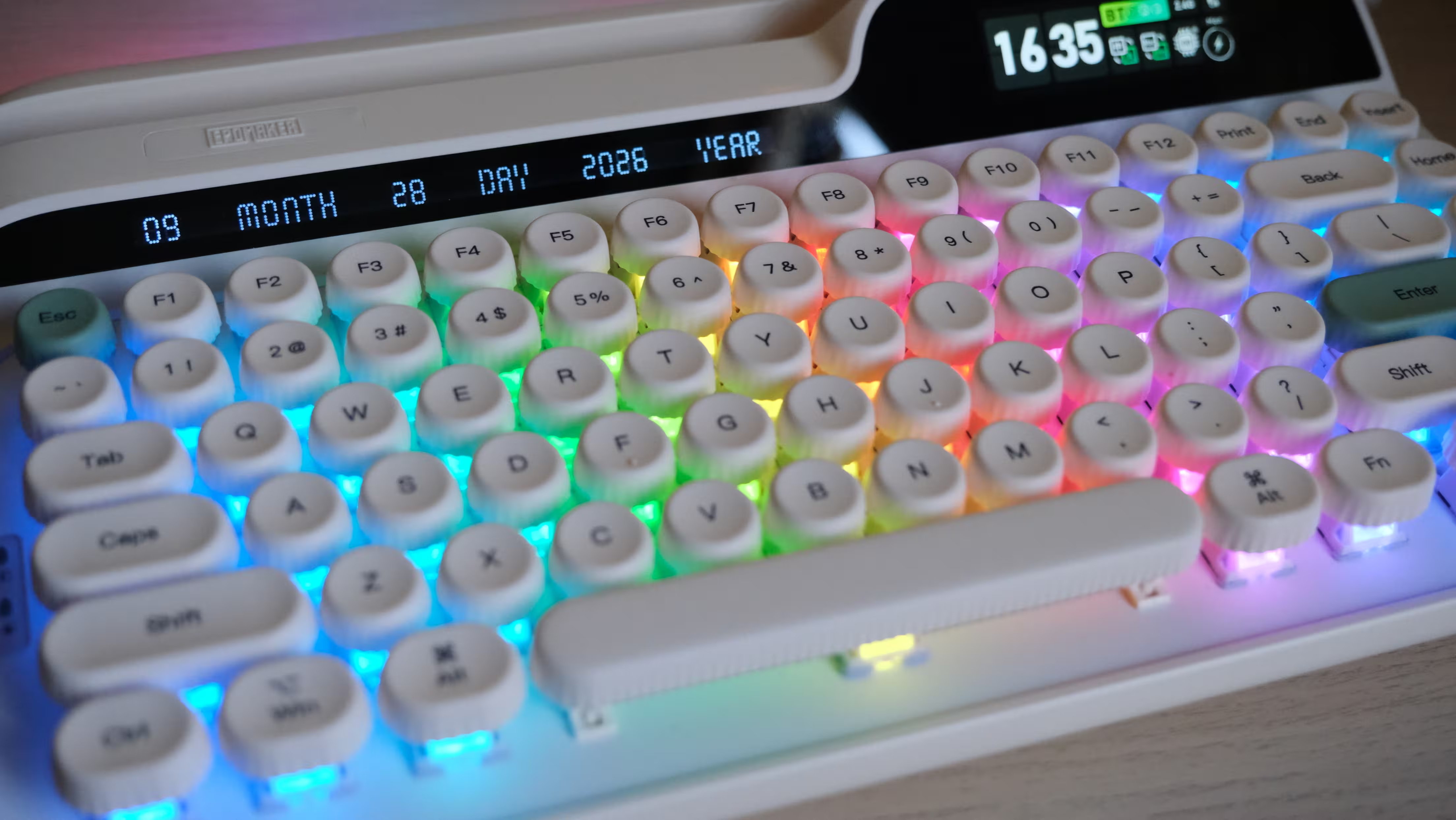
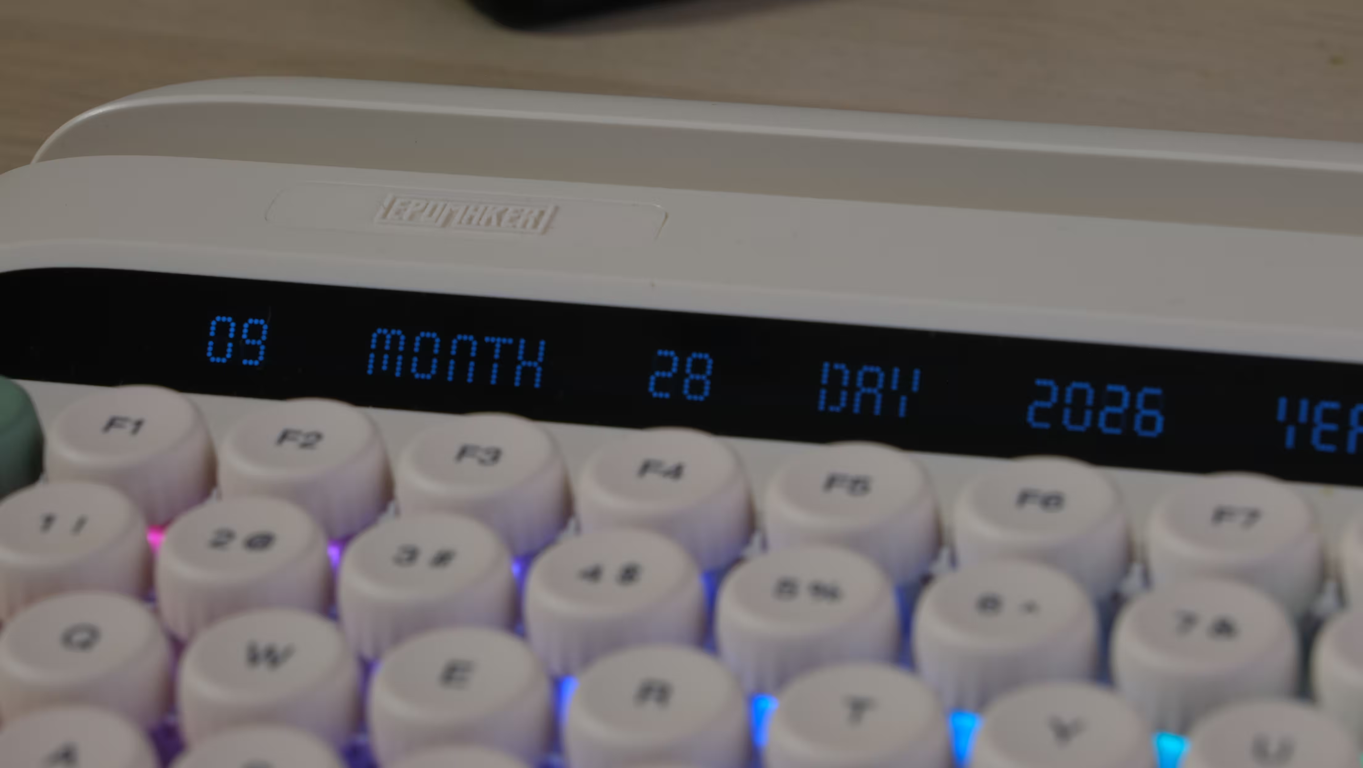
The viewing angle of the narrow date display is disappointing. Readability depends on where your eyes are relative to the keyboard, and a display becomes less convenient when you need to change your sitting position to read it.
I also struggled to find much need for it. The date is already available on the computer, phone or tablet in front of me. Unless announcing today’s date is part of your job, another dedicated reminder is difficult to get excited about.
The right-hand display is more interesting, but there are compromises there as well.
You choose between showing an image or animation and displaying useful information such as the clock or battery status. In my setup, switching between these options involved EPOMAKER’s software, and the process felt slower than I would have liked.
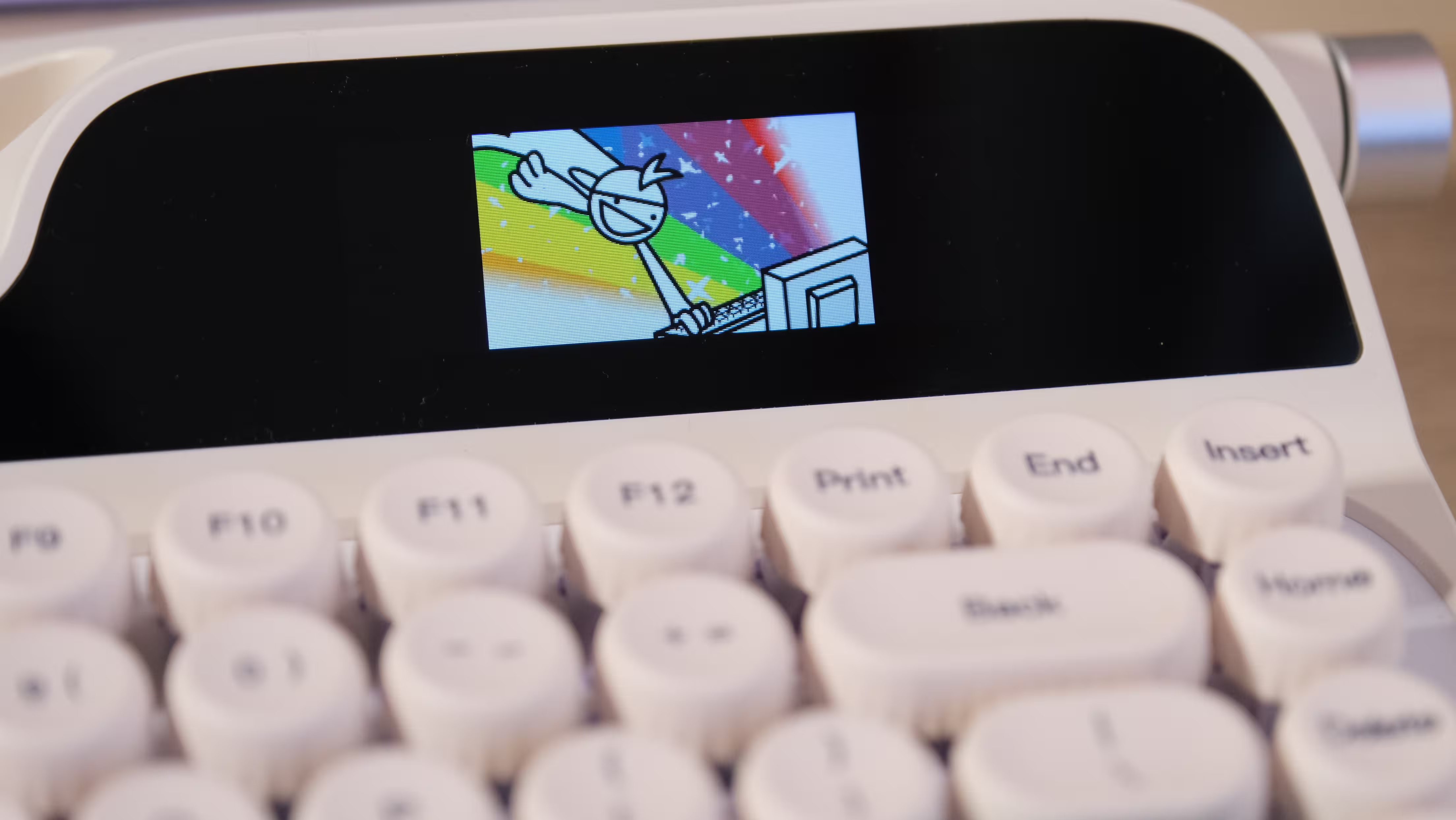
Uploading an image also required a wired connection. That takes some spontaneity out of customizing a wireless keyboard. After the initial experimentation, I found it easier to settle on one display arrangement and leave it alone.
I would have liked more useful options. A running character count or a typing-speed display, for example, would give this screen a clearer purpose. Some existing elements, such as the Windows or Mac indicator, felt more like permanent space fillers than information I regularly needed.
The lighting makes a stronger visual impression. RGB illumination around the keys and along the body looks attractive, although the original keycap legends are not shine-through. Light appears around the keys; the letters themselves do not glow.
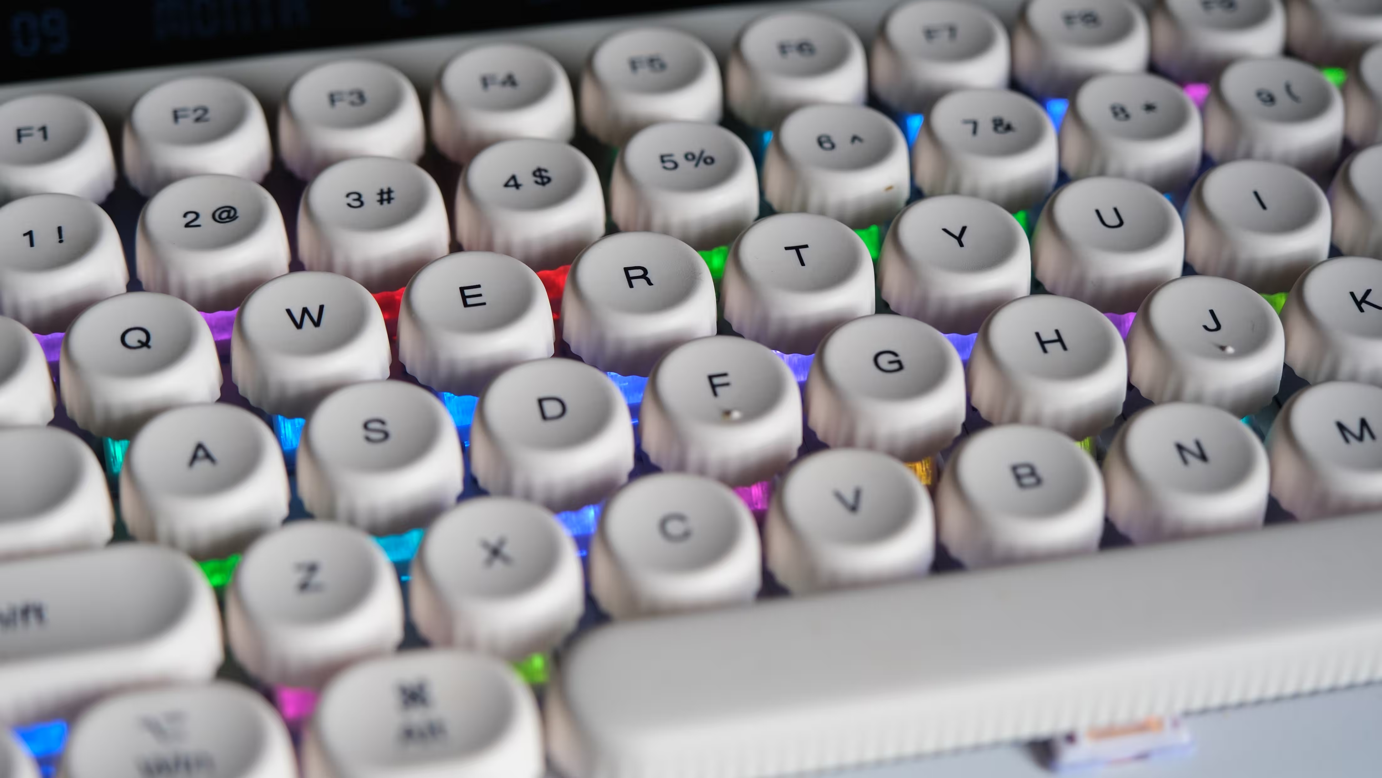
A restrained, static color works particularly well with the retro design. Alternatively, if you would prefer your typewriter to host a music festival, the available effects can accommodate that too.
There are plenty of lighting combinations to explore, with shortcuts listed in the included guide. Learning them occasionally feels like memorizing special moves in Mortal Kombat, only with fewer uppercuts and considerably more desk lighting.
The additional light strip across the rear completes the effect, giving the Glyph something to show off even when viewed from the other side of the desk.
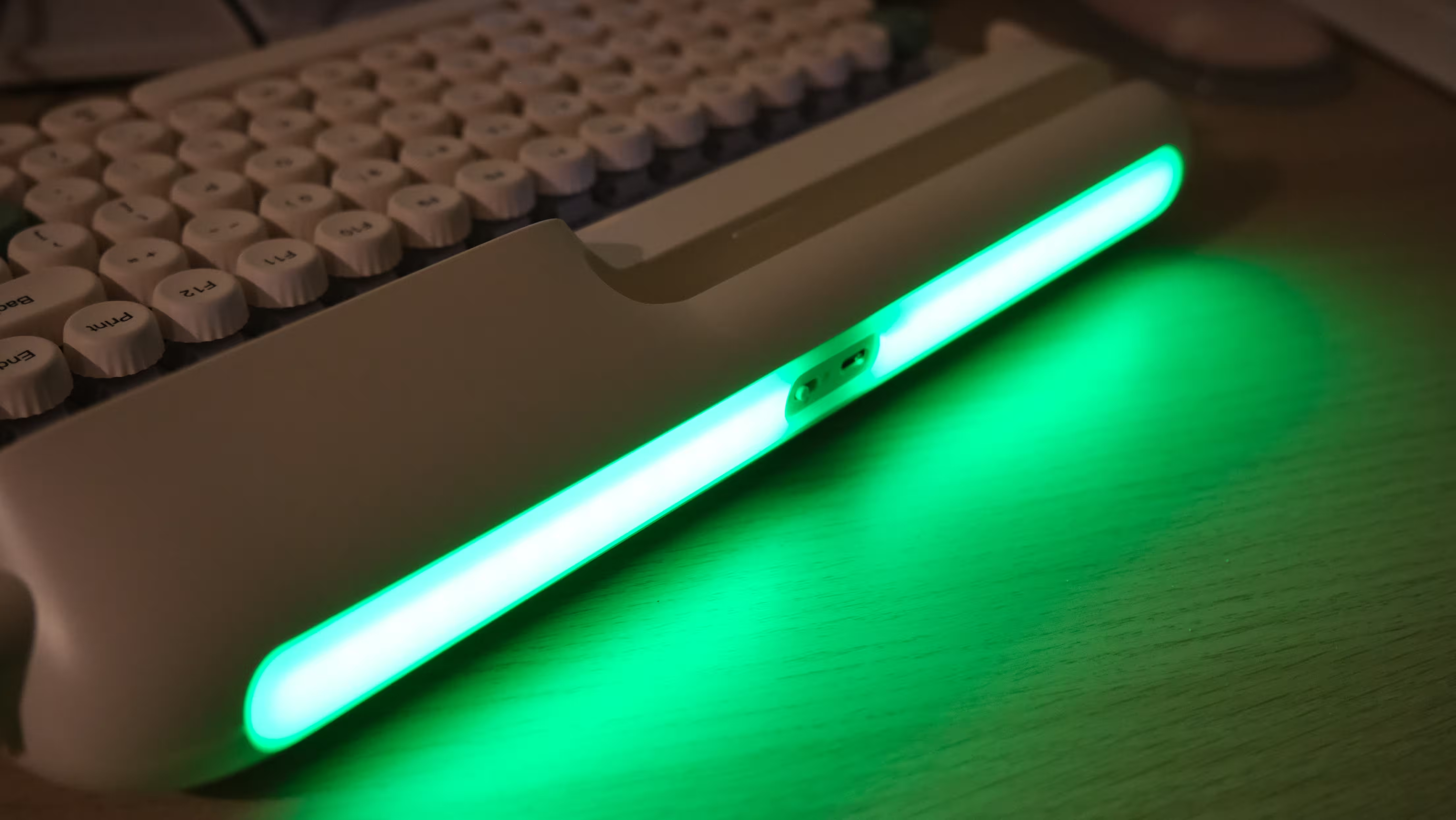 | 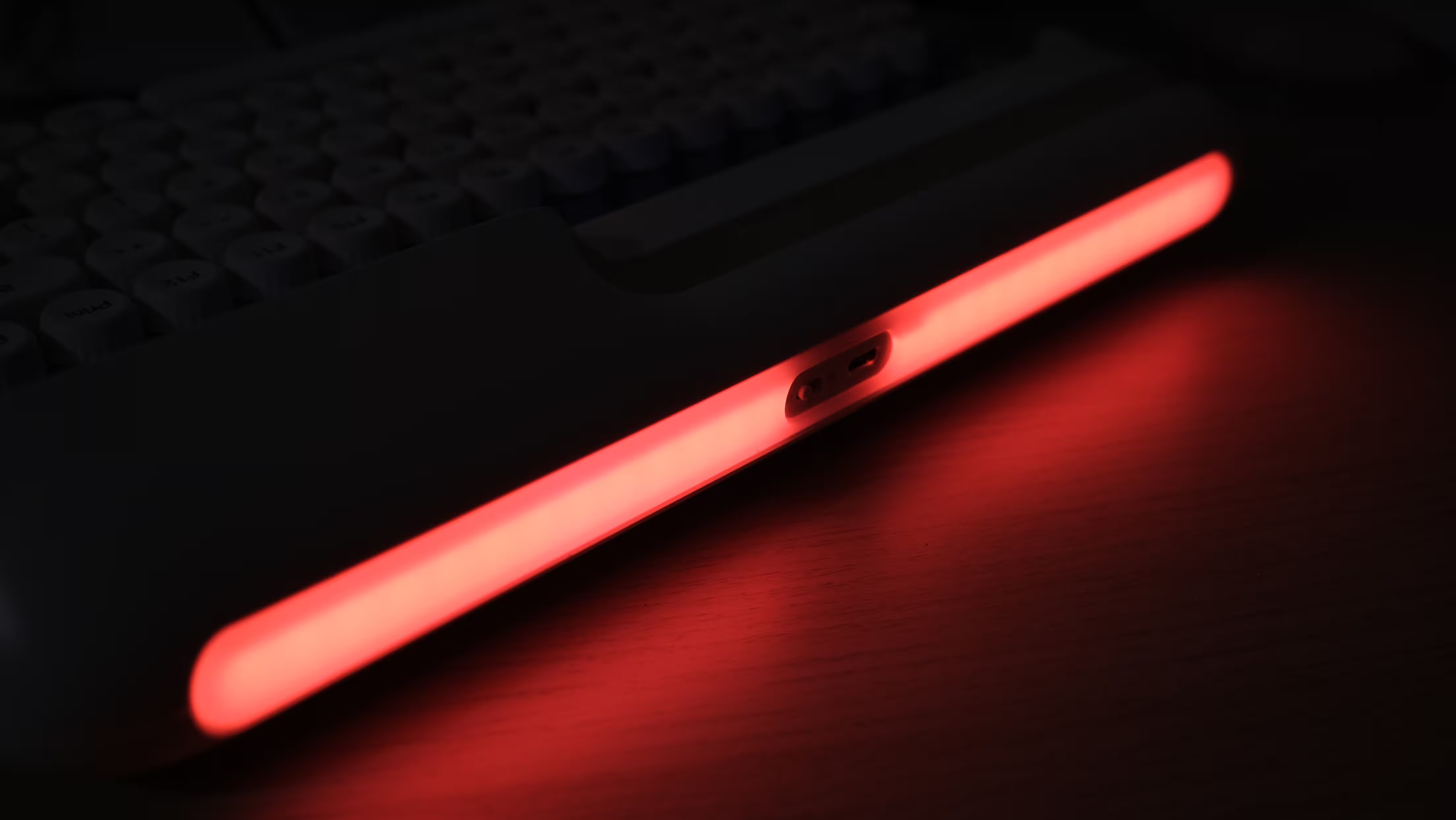 |
Connectivity and Software: Flexible, With a Few Frustrations
The Glyph supports wired USB-C, a 2.4GHz wireless receiver and Bluetooth. Multiple Bluetooth pairings are useful for switching between a computer, laptop and mobile device.
The phone and tablet slot makes sense alongside those options. Pairing a tablet with the keyboard can create a pleasant little writing station.
However, check how securely your particular device fits. Its dimensions, case thickness and weight all matter. Larger tablets may work better in portrait orientation, and screen size alone does not tell you whether a device will sit comfortably in the slot.
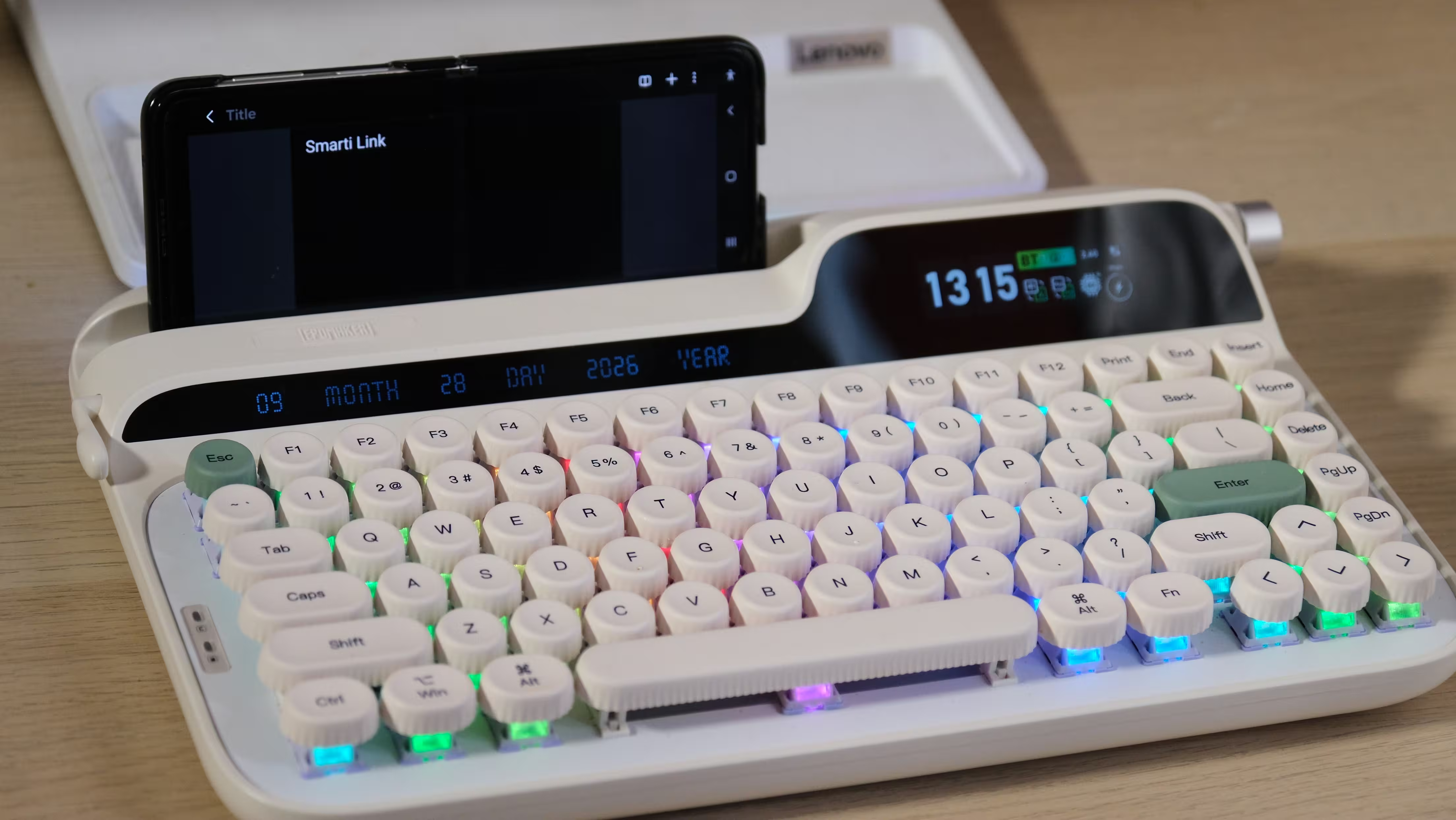
Customization includes key remapping, macros, lighting adjustments and image uploads. These are useful capabilities, but the Glyph should not be confused with a VIA- or QMK-based keyboard. EPOMAKER’s own tools are the main route to configuring it.
Setting or synchronizing the clock also involves the software, at least initially. For a keyboard with built-in displays, that feels unnecessarily awkward. I would have appreciated a straightforward way to adjust the time and date directly on the keyboard.
For gaming, the connection options and support for simultaneous key inputs are useful. However, features such as SOCD do not turn its conventional mechanical switches into Hall Effect switches with adjustable actuation points.
.avif)
I see the Glyph primarily as a keyboard for typing and general use. It can also be used for games, but it would not be my first choice for a setup focused on competitive shooters. If adjustable actuation or other magnetic-switch features are high on your shopping list, its retro appearance is unlikely to compensate for their absence.
Hot-Swappable Switches: Customizable Does Not Mean Easy to Disassemble
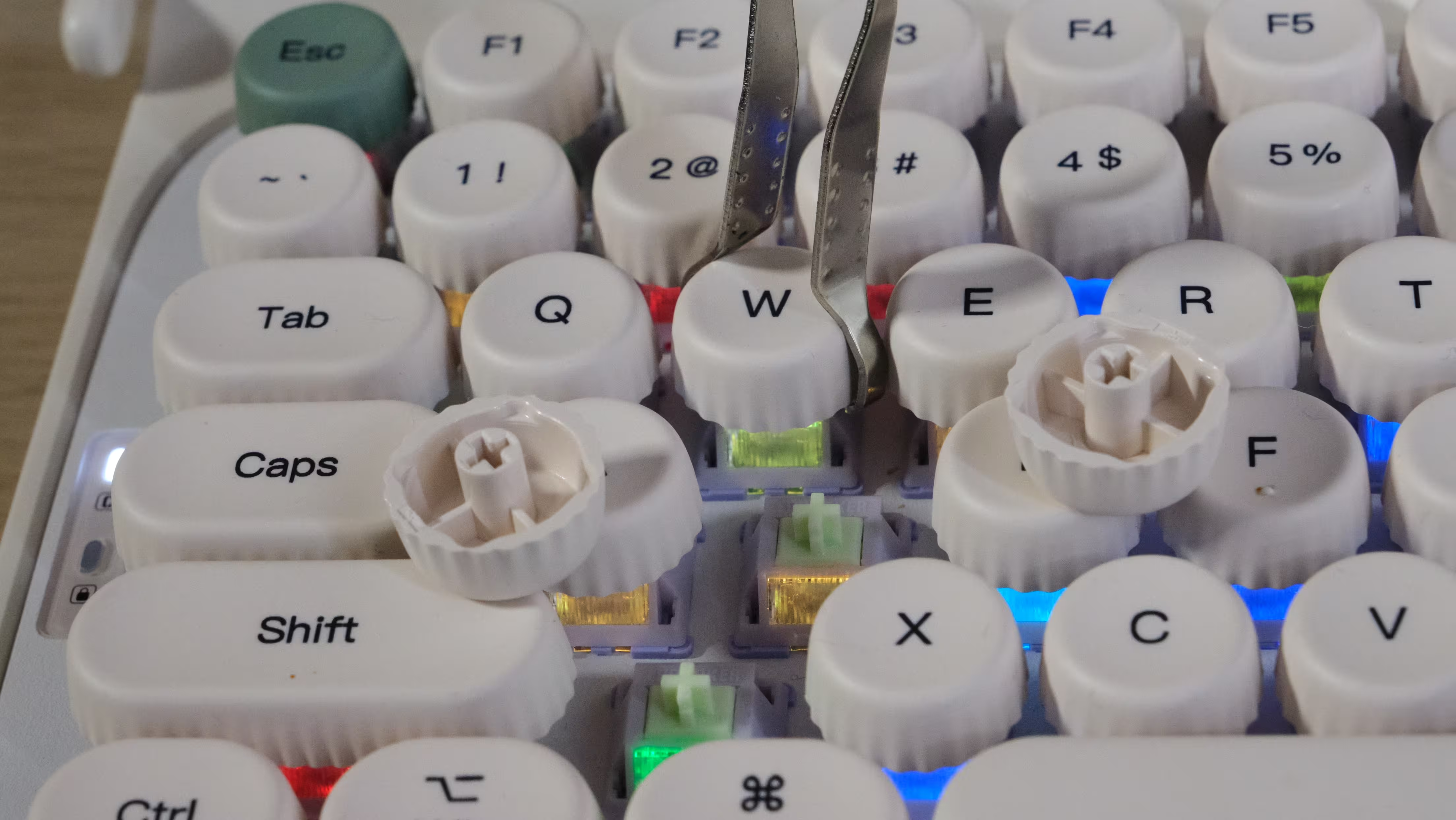
Hot-swap support allows compatible mechanical switches to be replaced without soldering. If the light Wisteria V2 switches are not to your taste, that flexibility is valuable.
The keycaps are replaceable as well, although you should check the required key sizes and compatibility before ordering another set.
Replacing switches and keycaps is not the same as having easy access to everything inside the case, however.
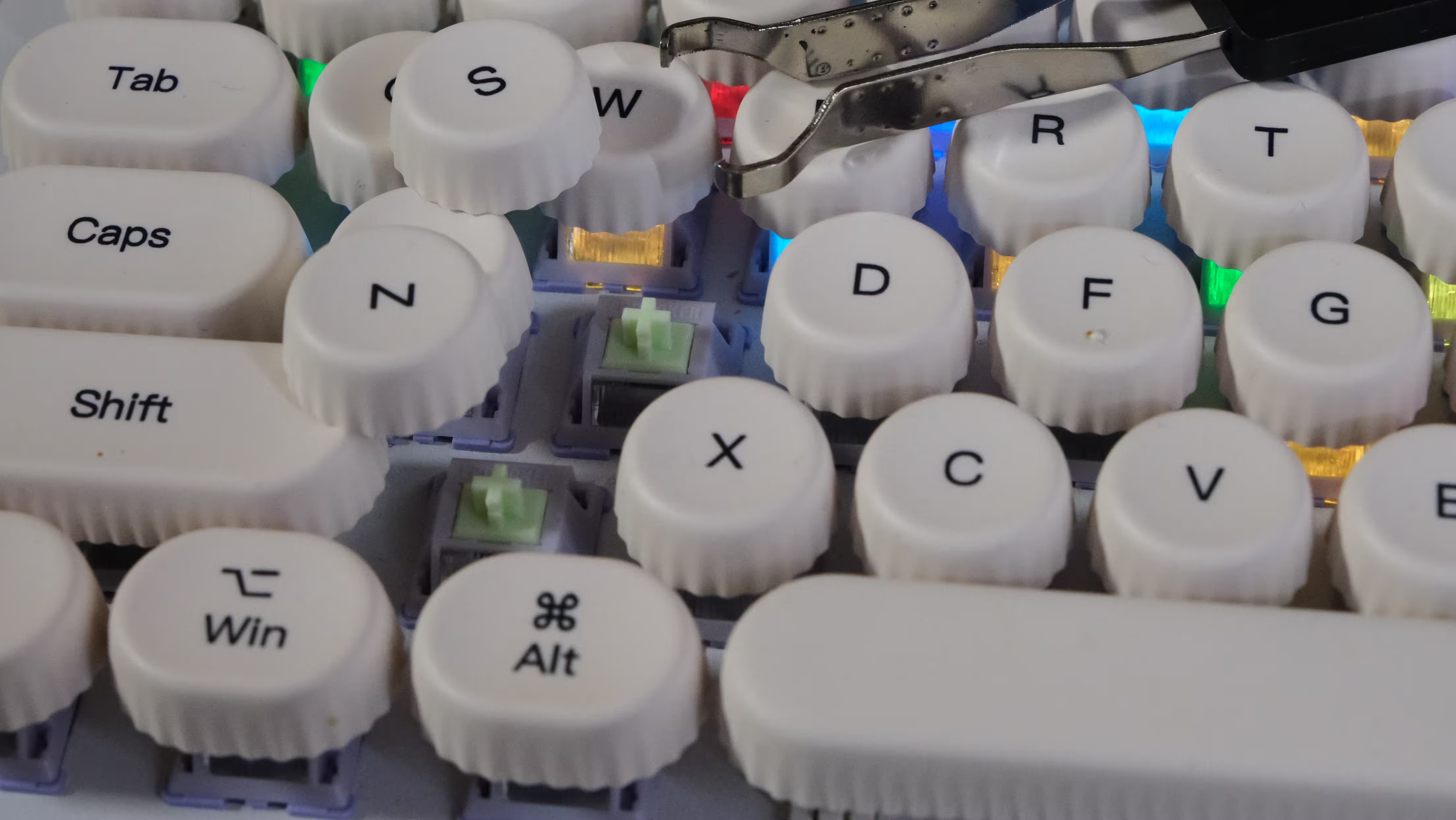 | 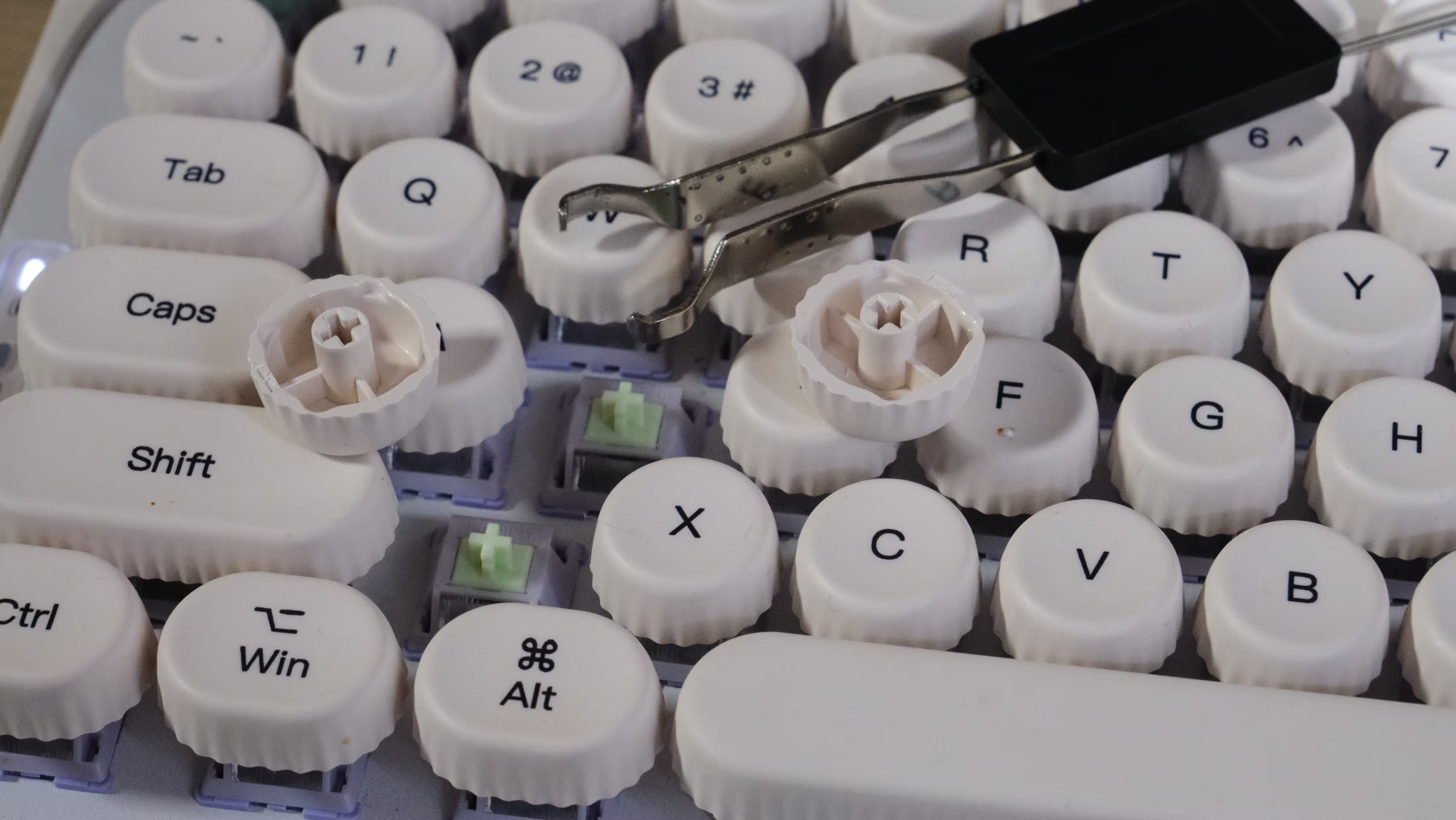 |
The lack of obvious screws and the way the enclosure fits together make internal modifications less straightforward. Opening the keyboard to change foam or experiment with its construction is a different proposition from pulling out a switch.
If you enjoy regularly dismantling and modifying your keyboards, the Glyph would not be my first recommendation as a project platform. Its strongest appeal is the complete combination you get out of the box.
Battery: A Large Capacity, Without Promising a Fictional Runtime
The 8,000mAh battery is substantial, but capacity alone does not establish how long a keyboard will run.
RGB brightness and effects, the displays, connection mode, sleep behavior and daily usage all influence power consumption.
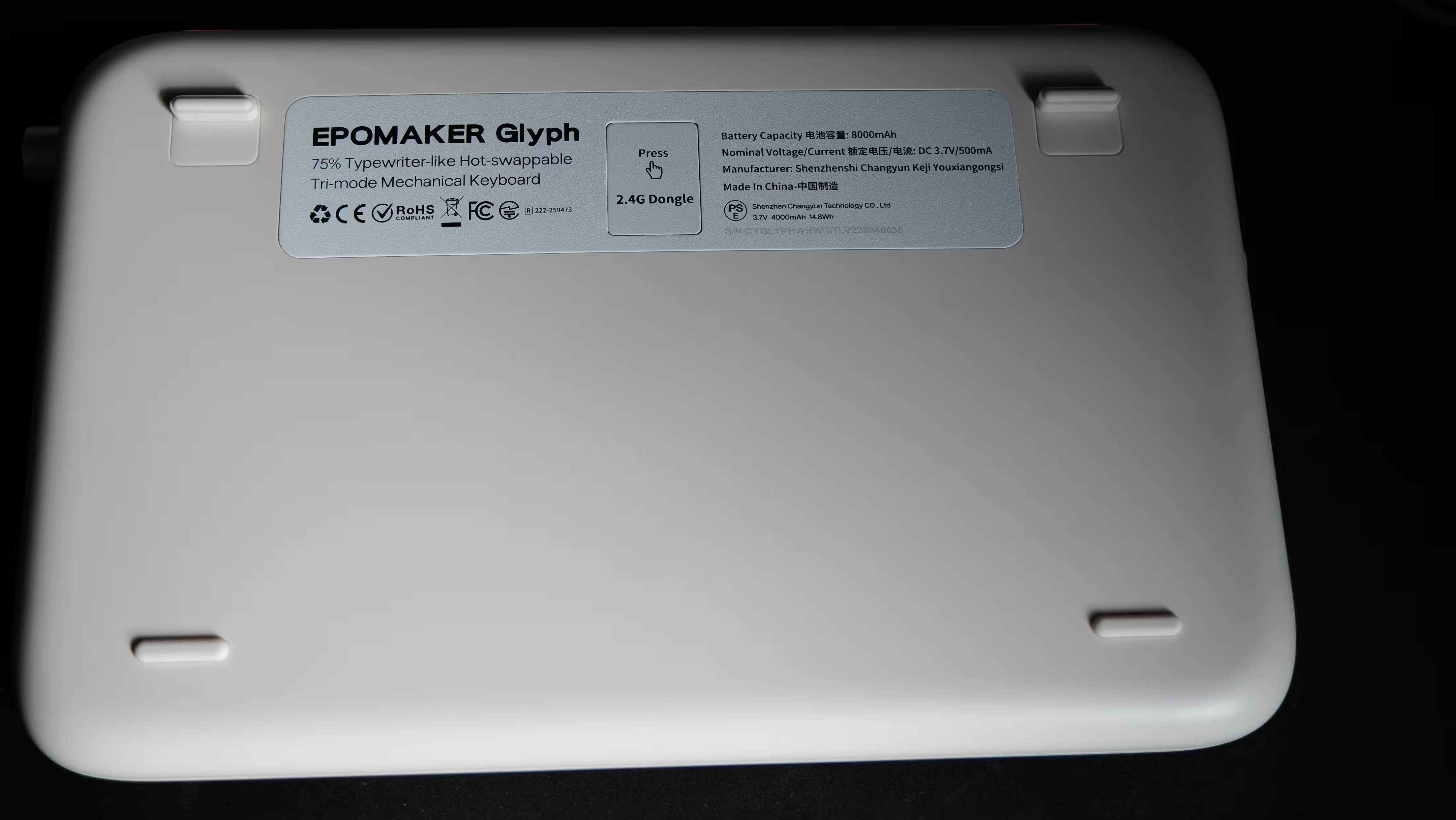
The capacity gives reason to expect useful endurance, particularly with the lighting reduced or switched off. However, a precise claim such as “one month between charges” needs a full battery test, rather than an estimate based on the number printed in the specifications.
The practical benefit is that you can continue working over USB while charging. A depleted battery therefore does not have to interrupt a writing session, provided a cable is available.
I did briefly wish that such a large battery could also serve as an emergency power bank. That is not a feature offered here, although it would have been a handy extra.
Value for Money: $139 for a Design You Need to Love
Part of the Glyph’s $139 price pays for its personality: the typewriter-inspired body, round keycaps, displays and nostalgic lever.
If those elements do not appeal to you, the case for buying it becomes much weaker. Three connection modes, RGB lighting, a large battery and hot-swappable switches are useful features, but they are not exclusive to this keyboard.
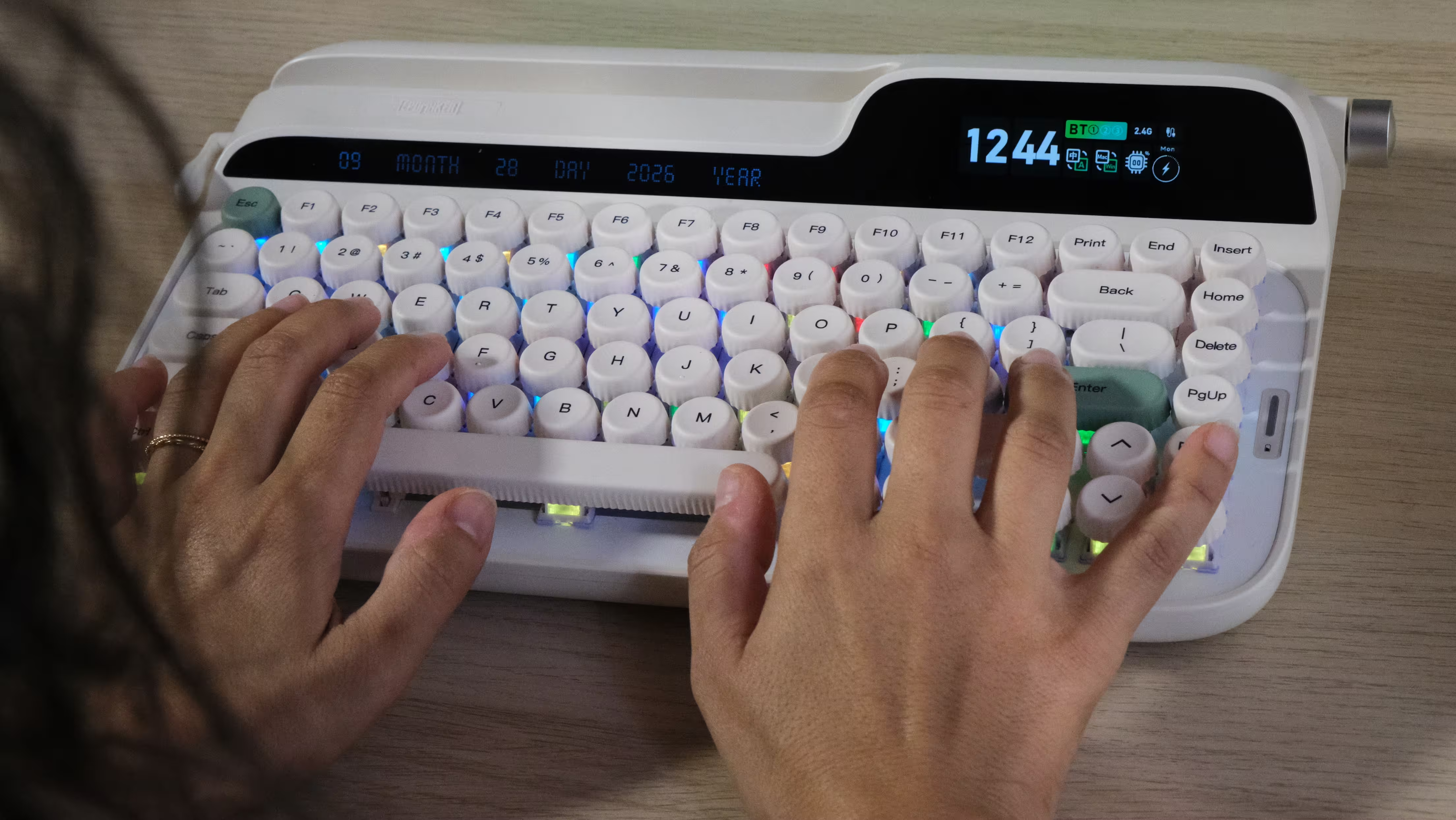
For someone building a retro desk setup, a writer who enjoys a satisfying mechanical typing sound or a buyer who wants their keyboard to contribute to the room’s appearance, the Glyph has a clear attraction.
For someone prioritizing a low typing height, adjustable tilt or easy portability, its design involves more significant compromises.
International buyers should also treat $139 as a reference price rather than assume it represents the final cost everywhere. Applicable taxes, delivery charges and the seller’s warranty and return arrangements can change the overall value.
For a product whose comfort depends so much on personal preference, a straightforward return policy is particularly worth considering.
What I Liked
- Distinctive, cohesive typewriter-inspired design.
- Enjoyable typing sound and smooth linear switches.
- Wired, 2.4GHz wireless and Bluetooth connectivity.
- Replaceable switches and keycaps.
- Included wrist rest and dedicated receiver storage.
- Customizable color display and physical volume control.
- Large 8,000mAh battery capacity.
What Could Be Better
- Tall typing position and limited angle adjustment.
- Delicate-feeling lever with limited customization.
- Displays that offer more visual appeal than everyday usefulness.
Verdict: Let Your Hands Decide Before Your Eyes Do
EPOMAKER has succeeded in making the Glyph memorable. It has a recognizable identity, an appealing typing sound and enough connectivity and customization for everyday use.
With the right fit between its shape and your hands, it can make sitting down to write feel more enjoyable.
An unconditional recommendation at $139 is harder to give. The unusual ergonomics, the limited flexibility of the lever and the less-than-essential displays all deserve consideration before buying.
For me, the Glyph makes the most sense for someone who specifically wants this design, finds its typing position comfortable and enjoys the combination of nostalgic styling and modern features.
If your priority is simply a comfortable, dependable keyboard for long working days, its appearance alone is not a sufficient reason to choose it.
This modern typewriter can give your desk plenty of personality. Just make sure that personality does not get in the way of what you are trying to write.
Related Posts



“Some times I write about breakthrough startups, digital ecosystems, and how innovation is changing the way we build businesses.”

Discussion
Leave a Comment
Comments (1)
wow this thing looks bonkers, love the typewriter vibe! but tall keys? might wreck my wrists.. still curious tho