5 Minutes
One day your home screen looks the same as it has for years, and the next it doesn’t. That’s the tiny jolt a lot of people are getting right now when they spot Google Maps wearing a refreshed icon on Android and iOS.
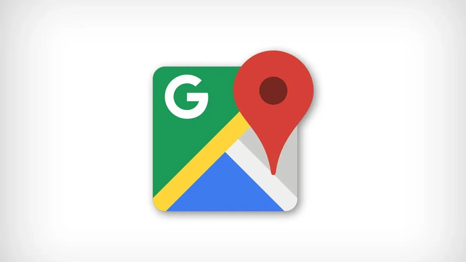
It’s still unmistakably Google Maps—a location pin, front and center—but the design has been quietly modernized. Think less “separate color tiles,” more “smooth, blended Google gradient.” The colors now melt into each other instead of sitting in distinct blocks, which makes the whole mark feel more in line with Google’s current visual language across its apps.
Look closer and you’ll notice another tweak: the pin itself appears a bit larger, and the circle inside it has grown too. That pushes the design outward, thinning the top ring of the pin and giving the icon a cleaner, more contemporary silhouette—subtle, but noticeable once you’ve seen it.
A tiny redesign with a long history behind it
Google Maps has been riding shotgun with smartphones since the early days. It was on the first iPhone, back when app icons were practically billboards for features. The original Maps icon leaned into that literalism: crisscrossing “roads,” a red pin, and even a Highway 280 sign—an unmistakable nod to Google’s backyard.
Later came the folded-map era: bright blocks of color, a pin to the right, and a prominent “G” in the corner. Android users will remember a close sibling of that design too, with small variations over time. This latest refresh is the next step in that visual evolution: less skeuomorphic, more brand-forward, and built for modern home screens where icons need to read instantly at a glance.
If you’re the type who never notices icon changes, this one might slip by. If you do notice, it’s the sort of tweak that makes the app feel newly “maintained,” even if you haven’t opened it yet.

Don’t see the new Google Maps icon yet? Try this
Google’s icon updates typically arrive with app updates, but rollout timing can vary by device, region, or even account. On Android, the updated look has been spotted in Google Maps version
If your phone is still showing the old icon, it’s usually not a mystery—there’s likely an update waiting.
- On Android: Open the Google Play Store, tap your profile icon (top right), go to “Manage apps & device,” then check for a pending Google Maps update and install it.
- On iOS: Open the App Store, tap your profile icon (top right), scroll to pending updates, and update Google Maps. If it doesn’t show up immediately, refresh the updates list and check again.
It sounds almost too simple, but the “refresh and try again” move on iOS can matter. Some users are seeing a second update appear only after reloading the page—after which the new icon finally lands.
The takeaway: if your Google Maps icon hasn’t changed, you probably haven’t actually received (or applied) the right update yet.
And yes—this is the kind of change that reminds you how often we “read” our phones without thinking. A new icon can make a decade-old habit feel just slightly different.
It also brings back an old truth about Maps: the design may be small, but the product has never been.
For longtime users, Google Maps carries a bit of history—especially on iPhone. While Android users got turn-by-turn navigation early (it felt like science fiction on phones like the Motorola Droid), iPhone didn’t get that experience through Google in the same way. Reports from that era suggested Google wanted deeper access and integration on iOS before giving Apple full turn-by-turn navigation. Steve Jobs famously pushed back, and the relationship cooled.
Then came the turning point: Apple replaced Google Maps as the default mapping app in iOS 6 (September 2012). A few months later, Google Maps returned to the iPhone as a standalone app in December 2012—this time with full turn-by-turn directions. Today, that feature is so standard it’s practically invisible. Back then, it was a battleground.
Now, the fight isn’t about whether Maps can navigate you home. It’s about polish, consistency, and staying recognizable in a sea of apps. And sometimes, that starts with something as small as a pin.


Comments
Reza
Is this rolling out worldwide or just beta? My icon's old, tried updates, nada. Google does these tiny tweaks then teases us, lol
datapulse
wow noticed the new Maps pin today, kinda subtle but it really refreshes the look. small tweak big vibe, almost makes me open it just to stare lol

Leave a Comment