
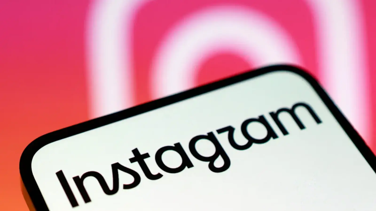
Scroll through Instagram and you might miss it at first. The camera icon is the same. Your feed looks unchanged. But at the very top, a familiar word has been retuned.
Meta has quietly rolled out a refreshed wordmark across Instagram's mobile apps, the first meaningful update to the logotype in more than a decade. Adam Mosseri posted the news on Instagram and Threads, calling the new treatment 'cleaner and more modern.' It's subtle. Intentional. And already visible to users on Android and iOS.
A quiet nudge, not a reinvention
Why tweak a wordmark people use every day? Because small shifts matter. The design team says the new wordmark preserves recognisable elements from the old one while introducing a refined font and styling that better fits today's interface norms. They reportedly explored hundreds of iterations before landing on this version.

That iterative process shows up in tiny details: letter spacing that breathes on small screens, stroke weights that read crisply across different resolutions, and curves tuned to echo the playful feel of Instagram's creative community. The change isn't flashy. It doesn't ask for attention. It aims to be read, quickly and naturally, amid the endless scroll.
Design teams often speak about brand systems. Here, the refreshed wordmark is one piece of a broader puzzle. Instagram's Design at Instagram page shared context about how the new logotype fits into a wider visual language—typography, rhythm, and how the brand shows up in product and marketing.
For users, the update is mostly cosmetic. For designers and brand strategists, it's an important signal: Instagram is reasserting who it wants to be on mobile screens in 2026. Expect the new wordmark to appear in other touchpoints in the months ahead, from promos to in-app surfaces.
And for anyone asking if a logo tweak can change perception: sometimes, it does. Especially when it's the tiny, well-considered details that make daily interactions feel more polished.

“I love exploring gadgets, apps, and trends that redefine how we connect, work, and play in a digital world.”

Discussion
Leave a Comment
Comments
No comments yet. Be the first.