
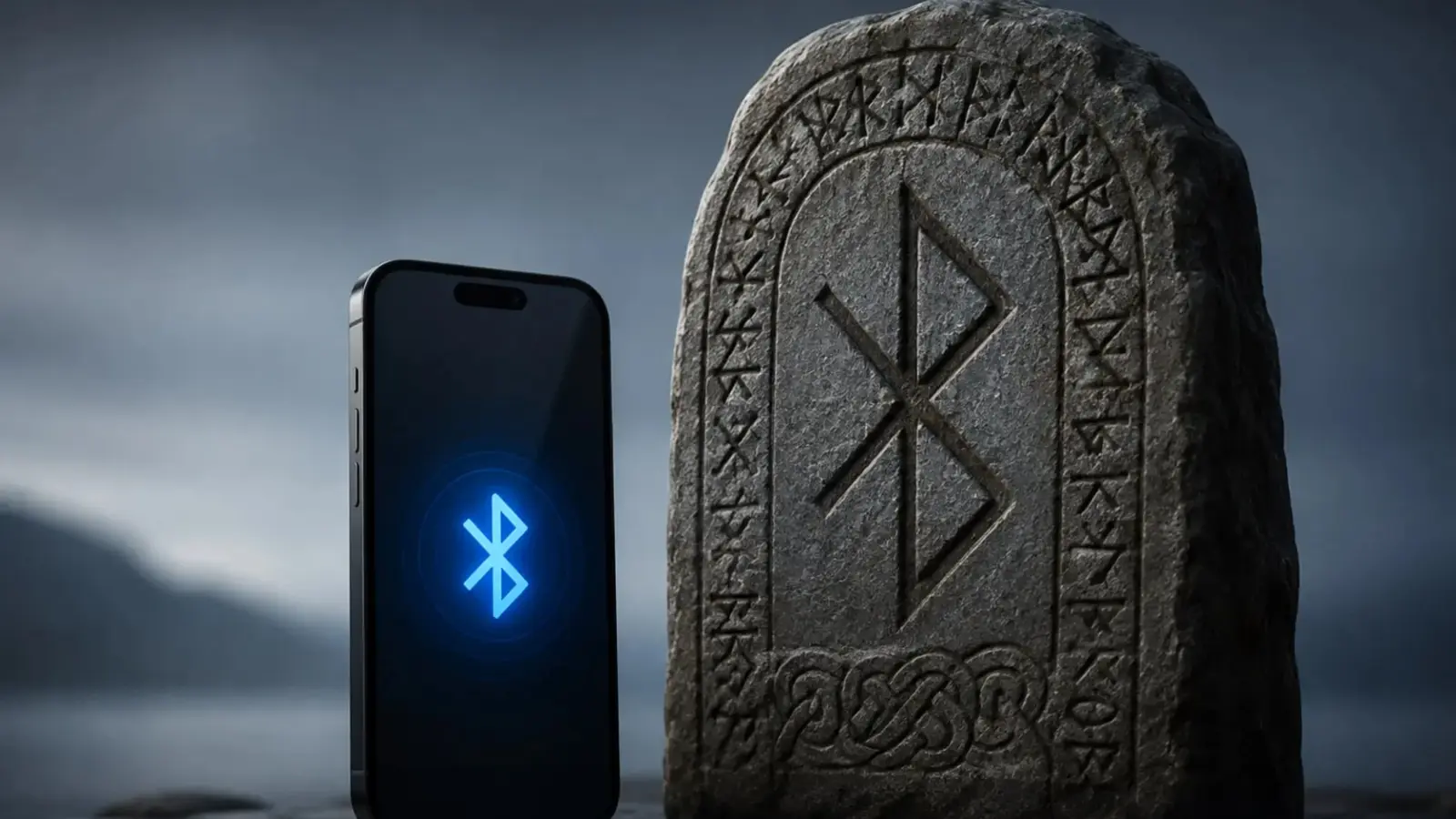
Stare at your phone's tiny blue icon for a moment. Strange as it sounds, that little symbol borrows its shape from a Viking's signature written more than a millennium ago.
A Viking rune that became a tech emblem
Back in the tenth century there was a Danish king named Harald Bluetooth, or Harald Bl?tand in his language. He earned a nickname tied to a discolored tooth, reportedly blue or dark gray. More importantly, history remembers him as the ruler who helped unite parts of Scandinavia around 958. Fast forward to the 1990s and engineers hunting for a name for a short-range wireless standard reached back into that story.
The emblem we now call the Bluetooth logo is not a random squiggle. It fuses two runes from the old runic alphabet: Hagall for H and Bjarkan for B. Those two signs, pressed together, stand for Harald Bluetooth. The Bluetooth logo is literally a bind rune: H and B fused to echo Harald’s initials.

Why use a Viking's name for wireless tech? The choice was partly playful and partly symbolic. During early talks to standardize radio-based links between phones and computers, people from companies like Nokia, Ericsson, and Intel wanted something memorable. Jim Kardach, an Intel engineer, suggested "Bluetooth" as a working title because Harald represented union. The hardware and software were meant to stitch different devices together, much as the king had linked kingdoms. A temporary nickname stuck and became permanent.
It's a neat bit of design trivia with a strategic streak. The logo carries history, identity, and utility. It reminds us that logos often do more than look good; they tell a story, anchor a brand, and give engineers a shared metaphor to rally around.
Next time you toggle that tiny icon, think of runes carved into stone, a tenth-century ruler, and a 1996 meeting room where a casual suggestion turned into the name for a global wireless standard. Connection, it seems, has always been part symbol and part storytelling.


“I love exploring gadgets, apps, and trends that redefine how we connect, work, and play in a digital world.”

Discussion
Leave a Comment
Comments
No comments yet. Be the first.